- Study Abroad
- / gre
- / data analysis
A Complete Guide to GRE Data Interpretation with Practice Questions and Explanations


Author
03-10-2024


GRE Data Analysis, also known as Data Interpretation, is a vital part of the Quantitative Reasoning section of the GRE. It represents about 15% of the GRE Quant section, consisting of at least 6 out of the 40 questions. This highlights its critical role in achieving a competitive score in the Quantitative section. Mastery in Data Interpretation is not just beneficial but necessary, especially for those aiming for graduate programs in STEM fields where data analysis is crucial. The Quantitative section scores range from 130 to 170, and a strong score is typically 150 or above.
In this article, you'll encounter questions that test your ability to interpret and analyze data presented in tables, graphs, and charts. These questions might appear as multiple-choice or numeric entry, covering areas such as descriptive statistics, probability, and data visualization. Key topics include understanding trends, drawing inferences, and applying basic statistical methods. To excel in GRE Data Analysis, consistent practice and a strong grasp of these concepts are essential. This article will cover essential GRE Data Interpretation concepts, provide strategies to tackle different question types, and include practice questions with detailed explanations to enhance your preparation. So let's get started!
Types of GRE Data Analysis Questions
Mastering GRE Data Interpretation is essential as the exam includes a variety of question types—7 in total—within the Quantitative Reasoning section. These questions require you to analyze information presented in different visual formats. Understanding specific formulas and strategies is key to efficiently tackling these questions. The data is typically presented through various formats in the GRE, including:
- pie charts
- bar charts
- line graphs
- scatterplots & best-fit lines
- histograms
- Time Plots
Let’s take a closer look at the various types of data that candidates will face in the GRE Data Analysis section.
GRE Data Analysis - Pie Chart
Pie charts, or circle graphs, display data in a circular format, with each slice representing a portion of the whole. In the GRE Data Analysis section, these charts often depict percentages or parts of a given quantity. Each slice's size corresponds to its share of the total data. It’s important to grasp how to read these charts, as questions might ask you to compare different slices, find differences, or identify the percentage shown by a specific section.
Example
The pie chart shows the distribution of different types of fruits purchased by a grocery store over a month.
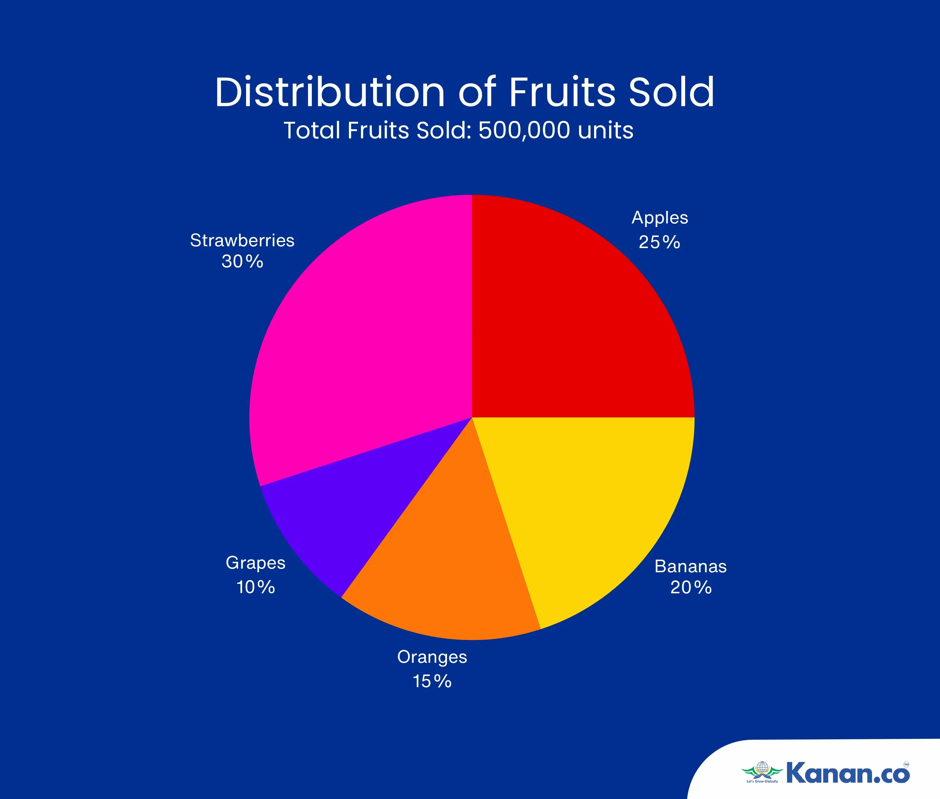
Candidates can use this information to answer related questions. For example, if the question asks for the number of apples sold, given that the total number of fruits sold is 500,000 and apples account for 25% of the total, you can calculate the number of apples by multiplying 25% of 500,000, which equals 125,000 apples.
GRE Data Analysis – Column Chart
A column chart, also referred to as a bar graph or bar chart, is a popular tool for visually representing data frequencies or counts. It consists of rectangular bars, with each bar's height corresponding to the frequency or proportion of the data categories. The bars, which can be displayed vertically or horizontally, are uniform in width. Column charts are particularly useful for comparing different categories, allowing you to easily spot the most and least frequent occurrences.
Example
The bar graph displays the number of books sold in different genres over a month.
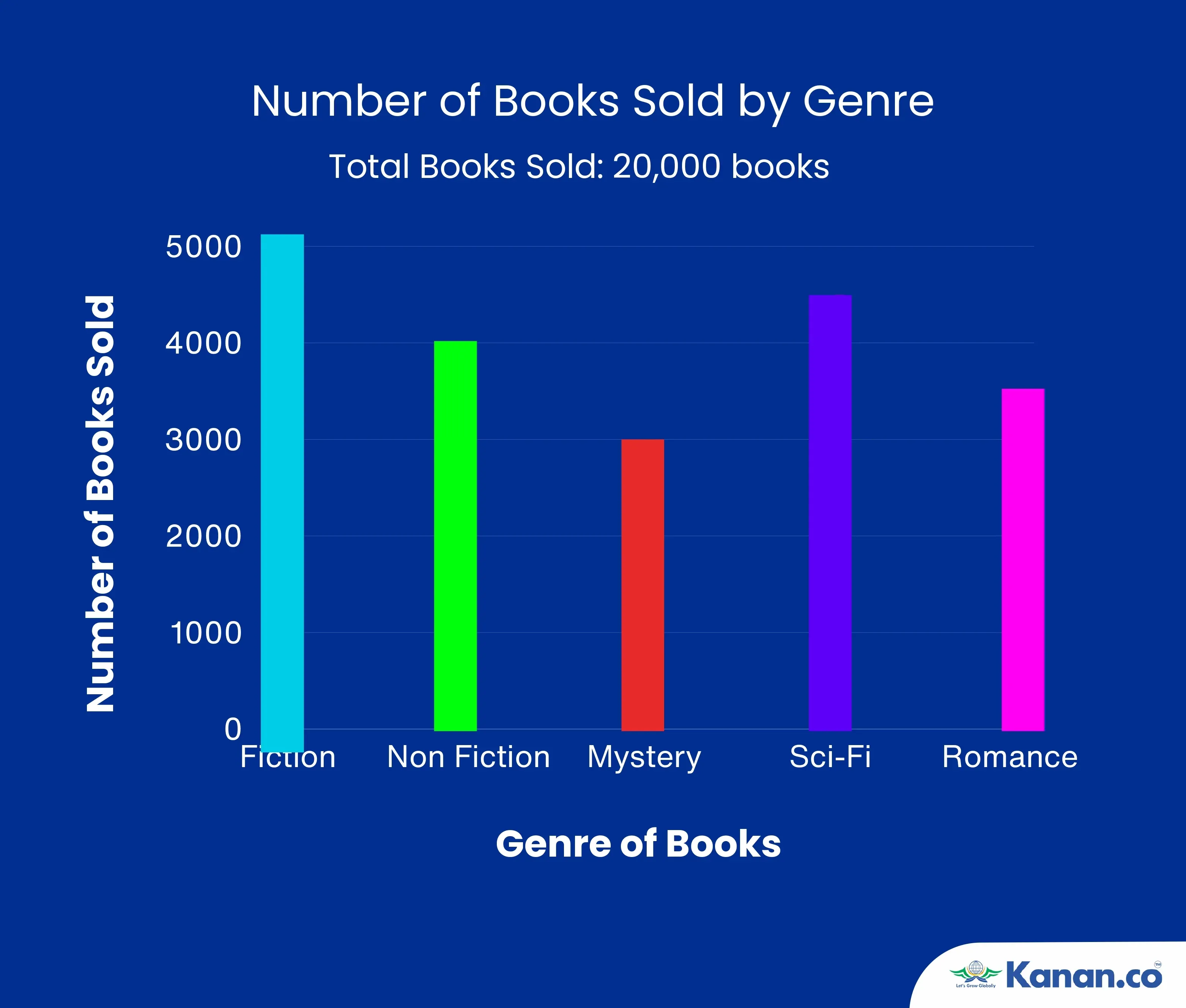
To solve related questions, you might need to extract specific information from the graph. For example, if the graph shows that fiction books are represented by a bar with a height of 100 units and each unit represents 50 books, you can calculate the total number of fiction books sold by multiplying 100 units by 50. This gives you 5,000 books sold in the fiction category.
GRE Data Analysis – Line Chart
A line chart displays data as a sequence of points connected by straight lines, making it an effective tool for tracking trends and changes over time. This type of chart is particularly useful for visualizing the progression or decline of data, helping to highlight patterns that might not be immediately apparent. Line charts are commonly used in areas like financial reports and weather forecasts to compare the performance of multiple variables across time periods. Unlike other charts, line graphs allow for a clear view of continuous data, making it easier to observe gradual shifts or sudden spikes in the data. Below is an example of a line graph.
Example
The line graph displays the monthly average temperatures for two cities over the course of a year.
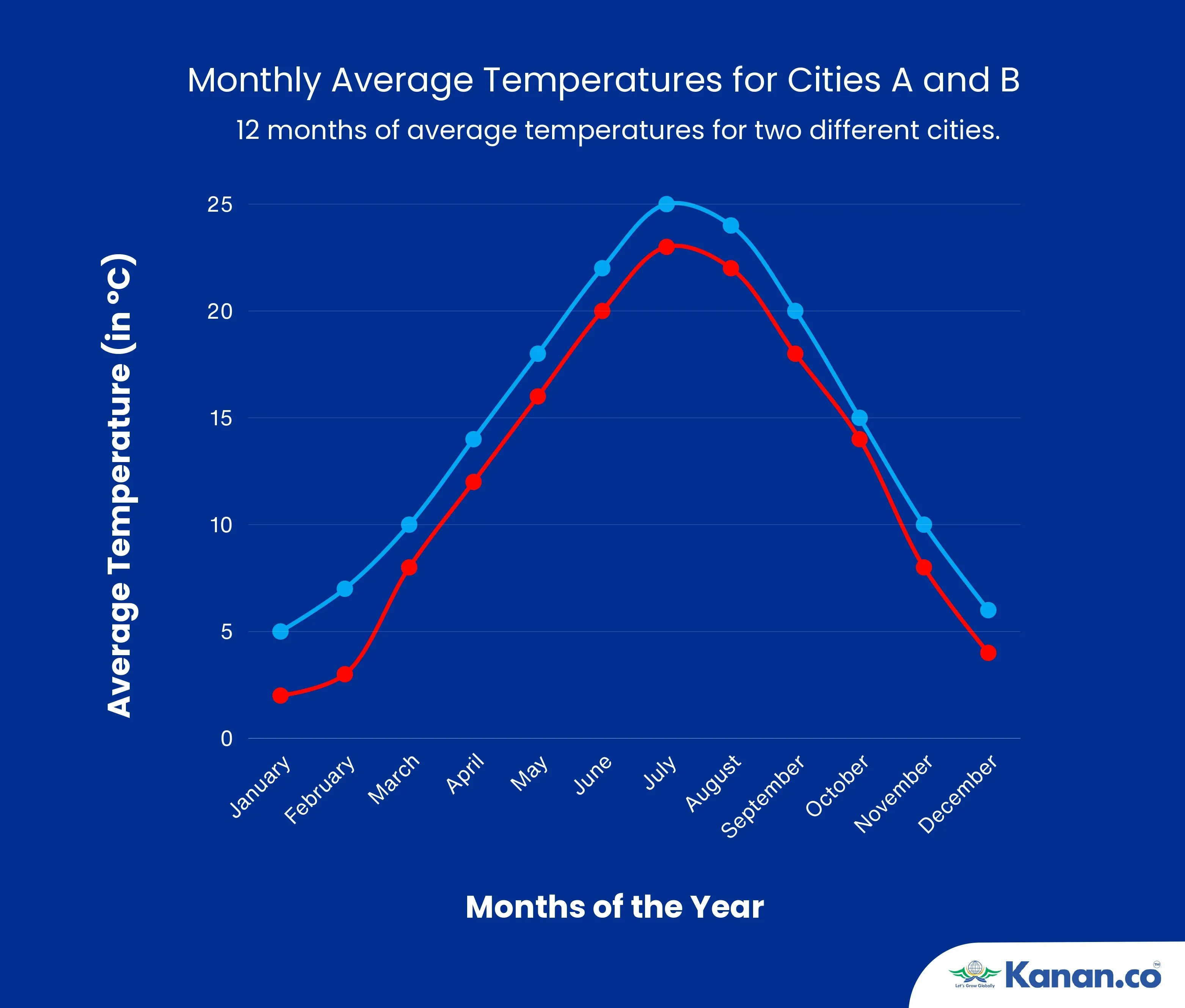
To interpret the graph, observe the solid blue line representing City A. During the summer months (June to August), the line shows an upward trend, with temperatures increasing from 22°C in June to a peak of 25°C in July, before slightly decreasing to 24°C in August. This indicates that City A experiences a rise in temperatures as summer progresses, followed by a slight cooling towards the end of the season.
GRE Data Analysis – Scatterplots
Scatterplots are essential for visualising the relationship between two numerical variables in a dataset. In these plots, one variable is placed on the x-axis, and the other on the y-axis, with each data point representing a pair of corresponding values. By organising data in this manner, scatterplots reveal correlations, patterns, and trends, while also drawing attention to any deviations or outliers present in the dataset. Often, a best-fit line or curve is added to the scatterplot, helping to highlight the overall trend and making it easier to predict future values based on the observed data.
Example
Imagine a study that investigates the relationship between the number of hours studied and the scores obtained on a GRE practice test by a group of students. The data collected includes hours studied (X-axis) and test scores (Y-axis) for each student.
Data Points:
- Student A: 2 hours studied, 240 score
- Student B: 4 hours studied, 270 score
- Student C: 6 hours studied, 285 score
- Student D: 8 hours studied, 300 score
- Student E: 10 hours studied, 320 score
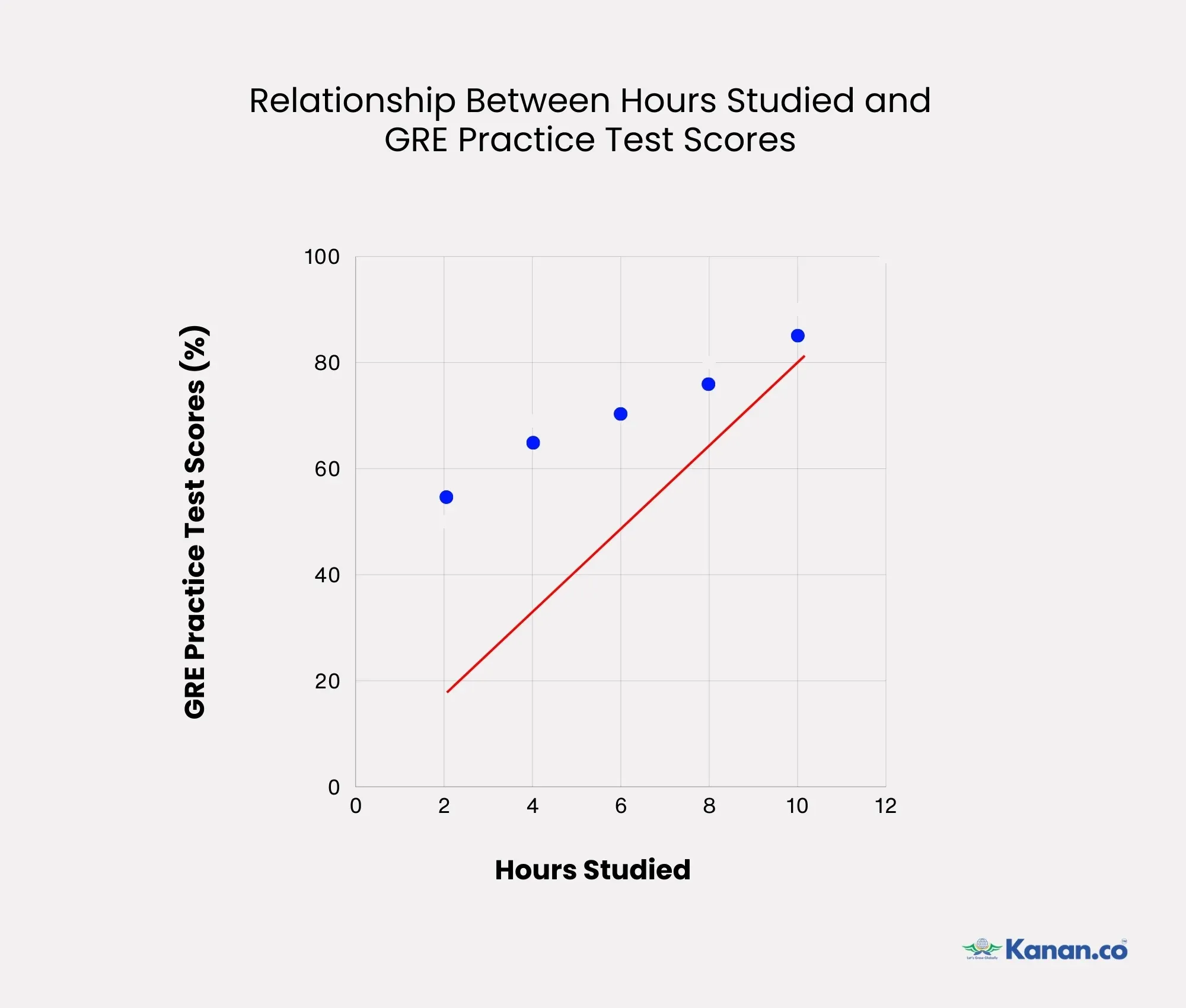
When plotted on a scatterplot, each student’s data is represented as a point on the graph. A best-fit line can be drawn through the points to show the trend - indicating that an increase in study hours tends to lead to higher test scores. This line can then be used to predict the test scores of other students based on the number of hours they study.
GRE Data Analysis – Histograms
Histograms are graphical representations of data distributions, used to visualize the frequency of values within specific intervals, often called bins or classes. Each bar in a histogram represents the number of data points that fall into a particular interval. The height of the bar shows the frequency of data points in that range. In GRE data analysis, histograms are used to help analyze the distribution of data and identify patterns or trends. They are particularly useful for understanding how data is spread out across different intervals, making it easier to interpret large datasets. By looking at a histogram, you can quickly see where data points cluster and identify any gaps or outliers in the data.
Example
Consider you have exam scores for 100 students and you want to understand how these scores are distributed. To do this, you can use a histogram, which helps visualize the frequency of scores within specific ranges. In this example, the scores are grouped into intervals or bins: 50-59, 60-69, 70-79, 80-89, and 90-99. Each bin represents a range of scores, and the histogram displays how many students fall into each range.
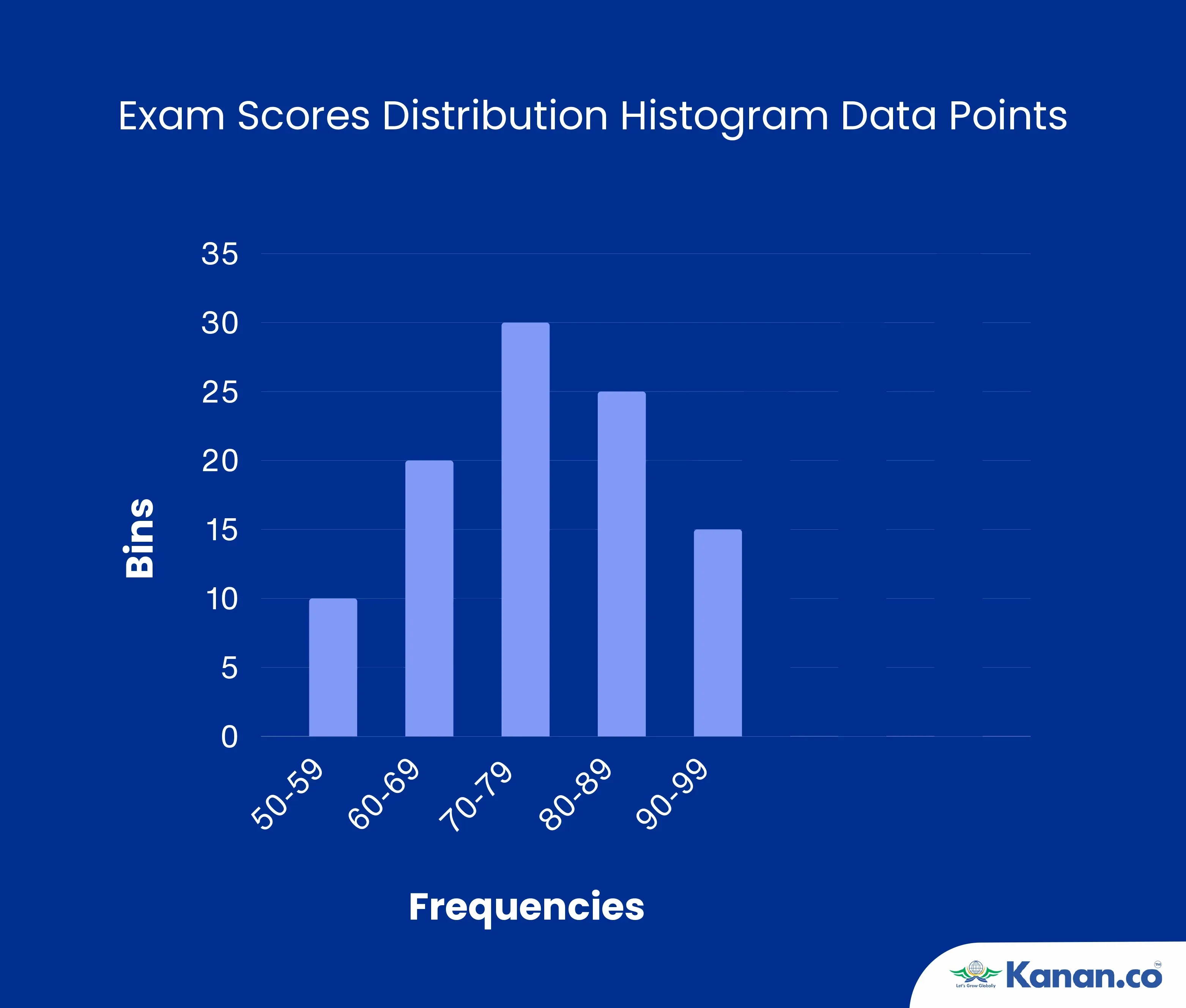
The histogram shows how many students scored within each score range. By looking at the height of each bar, you can see which score ranges had the most or fewest students. Here, a tall bar for the 70-79 range indicates that most students scored within this range, while a short bar for 50-59 shows fewer students achieved scores in that highest range. This helps to understand the distribution and identify which scores are most and least common among the students.
GRE Data Analysis – Time Plots
Time Plots, also known as time series plots, are used to display how a variable changes over time. They track the values of a variable at regular time intervals, such as daily, monthly, or yearly. By showing these values in a sequence, time plots help analyze how the variable evolves and identify any patterns or trends. In GRE data analysis, time plots are useful for understanding changes and trends in data over specific periods. For instance, they can be used to track economic indicators, sales figures, or any other time-dependent data. Time plots help identify long-term trends, seasonal effects, and unusual variations, which can be crucial for making predictions and informed decisions based on historical data.
Example
Imagine you are tracking the monthly sales for a department store throughout a year. You collect the following data:
January: $50,000
February: $55,000
March: $60,000
April: $62,000
May: $65,000
June: $63,000
July: $70,000
August: $68,000
September: $72,000
October: $75,000
November: $80,000
December: $85,000
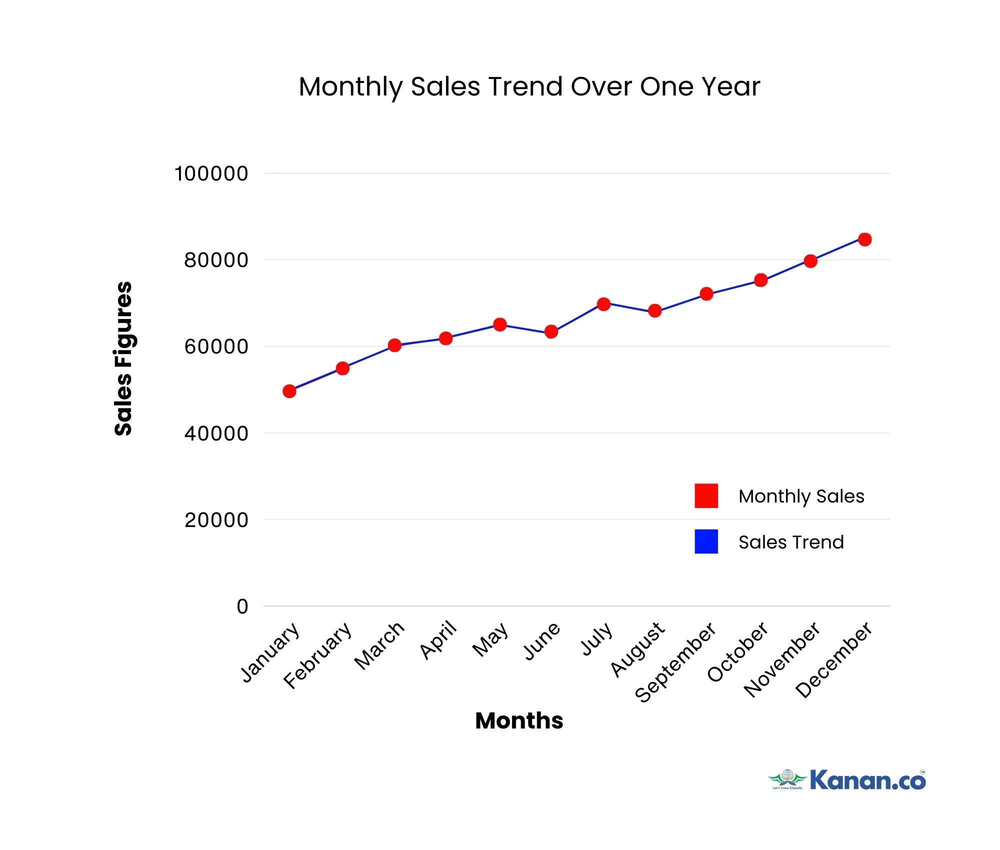
To create a time plot, you would place time (months) on the horizontal axis and sales figures on the vertical axis. Each data point on the plot represents the total sales for a specific month. By connecting these points with a line, you create a visual representation that shows how sales figures changed over the year. The line segments between the points highlight trends, such as increases or decreases in sales from month to month. This time plot helps to easily identify patterns, seasonal trends, and fluctuations in sales data over time.
GRE Data Analysis Practice Questions with Answers and Explanations
Below are the practice questions covering various topics in GRE Data Analysis. These questions include a mix of pie charts, bar charts, line graphs, scatterplots, histograms, and time plots, designed to help you prepare effectively for the GRE.
Practice Questions on Pie Charts
1. The pie chart below shows the distribution of time (in hours) that a student spent on different activities during a 24-hour day. The activities include Sleeping, Studying, Eating, Leisure, and Exercise.
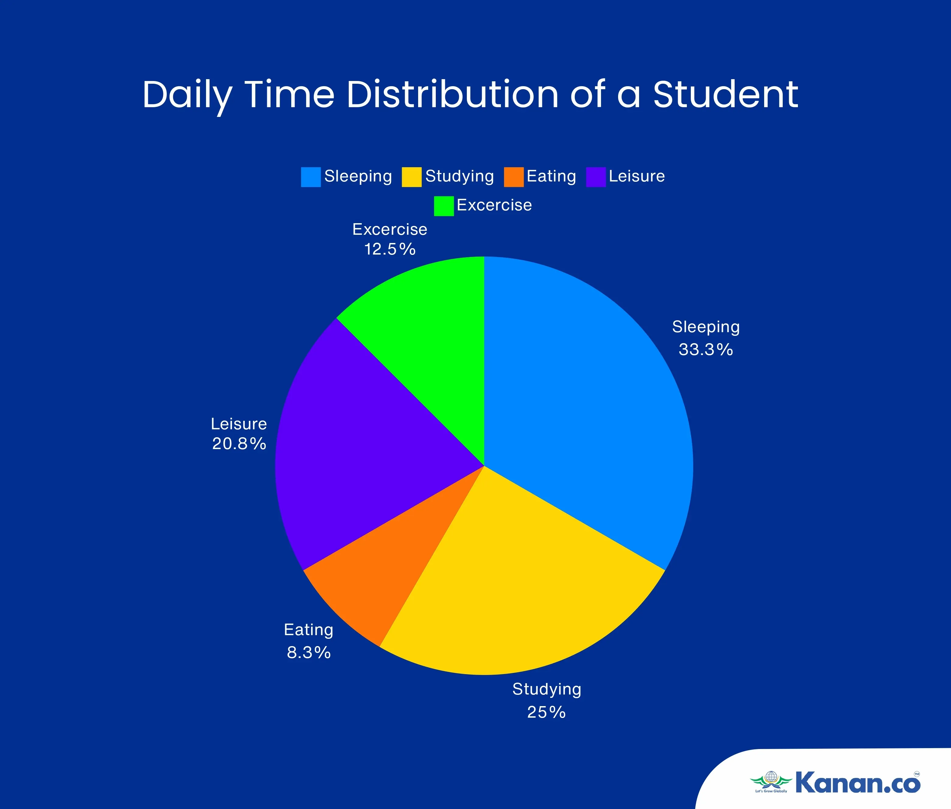
Based on the information provided in the pie chart, how many hours did the student spend on Studying?
Options:
A) 4 hours
B) 5 hours
C) 6 hours
D) 8 hours
Solution:
The chart shows that Studying accounts for 25% of the total time.
Since the total time is 24 hours, the time spent studying is calculated as:
Time spent on Studying = (25/100) * 24 hours = 6 hours
Correct Answer: C) 6 hours
Explanation:
In this pie chart, the "Studying" sector represents 25% of the chart. Given that the total time available is 24 hours, 25% of 24 hours equals 6 hours. Thus, the correct answer is 6 hours.
2. The pie chart below represents the annual budget allocation of a company. The budget is divided into five categories: Marketing, Research & Development (R&D), Operations, Salaries, and Miscellaneous.
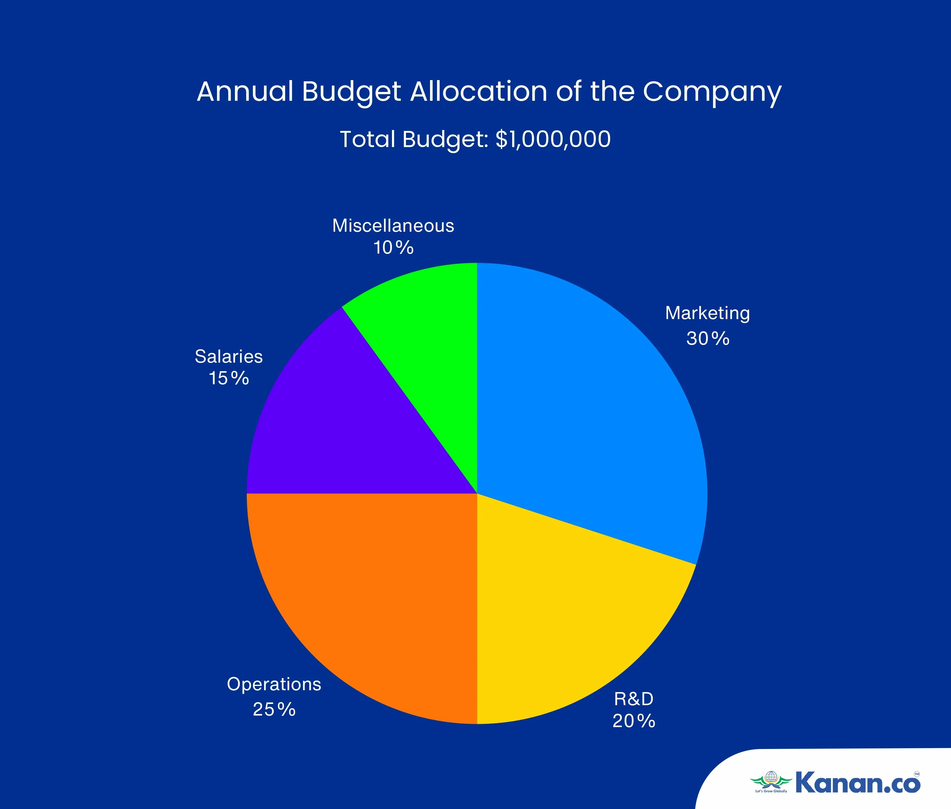
If the total budget is $1,000,000, and the amount allocated to Marketing is 1.5 times that allocated to Miscellaneous, what is the difference in dollar amounts between the budget for Marketing and R&D?
Options:
A) $50,000
B) $75,000
C) $100,000
D) $150,000
Solution:
Determine the dollar amounts allocated to each category:
Marketing: 30% of $1,000,000 = $300,000
R&D: 20% of $1,000,000 = $200,000
Operations: 25% of $1,000,000 = $250,000
Salaries: 15% of $1,000,000 = $150,000
Miscellaneous: 10% of $1,000,000 = $100,000
Calculate the difference between the Marketing and R&D budgets:
Difference = Marketing budget - R&D budget
= $300,000 - $200,000 = $100,000
Correct Answer: C) $100,000
Explanation:
This question requires you to first determine the specific dollar allocations based on the given percentages. After calculating these, the difference between the Marketing and R&D budgets was found to be $100,000, making option C the correct answer.
Practice Questions on Bar / Column Charts
3. The bar chart below illustrates the sales figures for four different products over the first quarter of the year. The products are: Product A, Product B, Product C, and Product D.
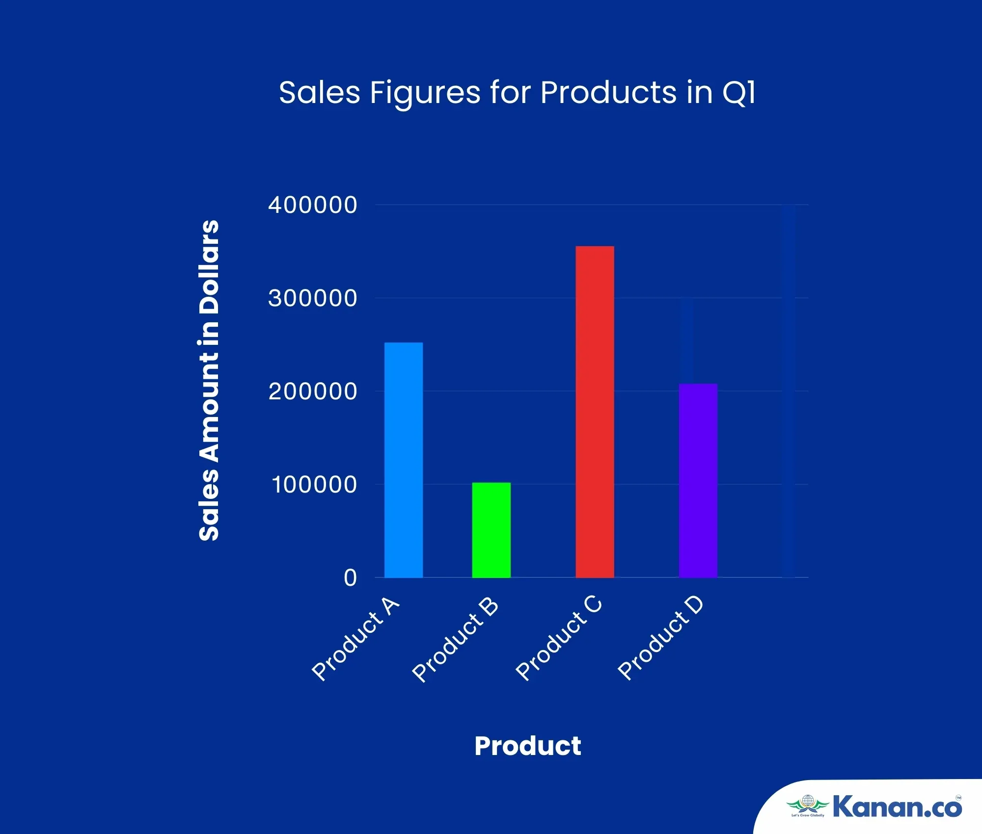
If the total sales for Product A and Product C combined amount to $600,000, and Product D's sales are twice that of Product B, what is the total sales amount for Product D and Product B together?
Options:
A) $450,000
B) $300,000
C) $700,000
D) $750,000
Solution:
Determine the total sales for Product A and Product C:
- Product A: $250,000
- Product C: $350,000
- Combined total = $250,000 + $350,000 = $600,000
Determine the sales for Product D and Product B:
- The chart shows Product D's sales as $200,000.
- According to the problem, Product D's sales are twice that of Product B, so,
Product B's sales = $200,000 / 2 = $100,000 - Total sales for Product D and Product B together = $200,000 + $100,000 = $300,000
Correct Answer: B) $300,000
Explanation:
To solve this problem, you first need to identify the sales amounts for each product from the bar chart. Given that the combined sales for Product A and Product C are $600,000, and knowing that Product D's sales are twice those of Product B, you can determine Product B's sales and then find the combined total of Product D and Product B. Thus, the total sales amount for Product D and Product B together is $300,000, making option B the correct answer.
4. The bar chart below shows the number of units sold for four different products over a six-month period. The products are Product W, Product X, Product Y, and Product Z.
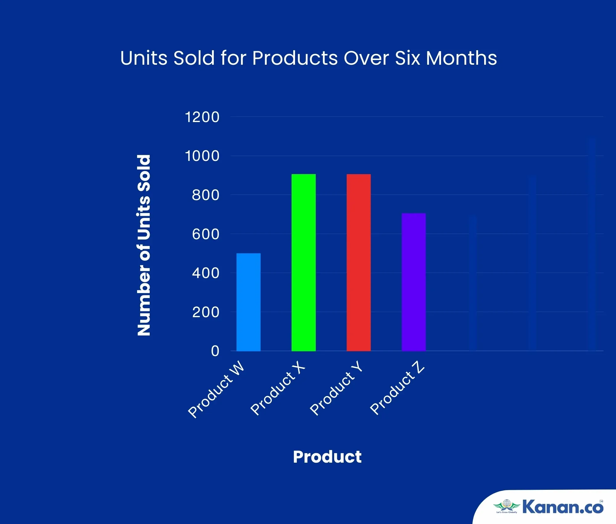
If the total sales for Product X and Product Y are 1.5 times the total sales for Product W and Product Z combined, and the total units sold for Product W and Product Z are 1,200 units, what is the total number of units sold for Product X and Product Y?
Options:
A) 1,200 units
B) 1,800 units
C) 2,000 units
D) 2,400 units
Solution:
Calculate the total units sold for Product W and Product Z:
- Product W: 500 units
- Product Z: 700 units
- Combined total = 500 + 700 = 1,200 units
Determine the total units sold for Product X and Product Y:
The problem states that the total sales for Product X and Product Y are 1.5 times the total sales for Product W and Product Z combined.
Therefore, Total units sold for Product X and Product Y = 1.5 × 1,200 = 1,800 units
Correct Answer: B) 1,800 units
Explanation:
To solve this problem, first, you need to calculate the total units sold for Product W and Product Z from the bar chart. Next, use the given relationship (1.5 times the total of Product W and Product Z) to find the total units sold for Product X and Product Y. This requires understanding the proportional relationships and performing straightforward multiplication. The total number of units sold for Product X and Product Y is 1,800 units, which makes option B the correct answer.
Practice Questions on Line Charts
5. The line chart below shows the monthly revenue (in thousands of dollars) for three companies—Company A, Company B, and Company C—over a six-month period. Each company's revenue fluctuated due to various market factors.
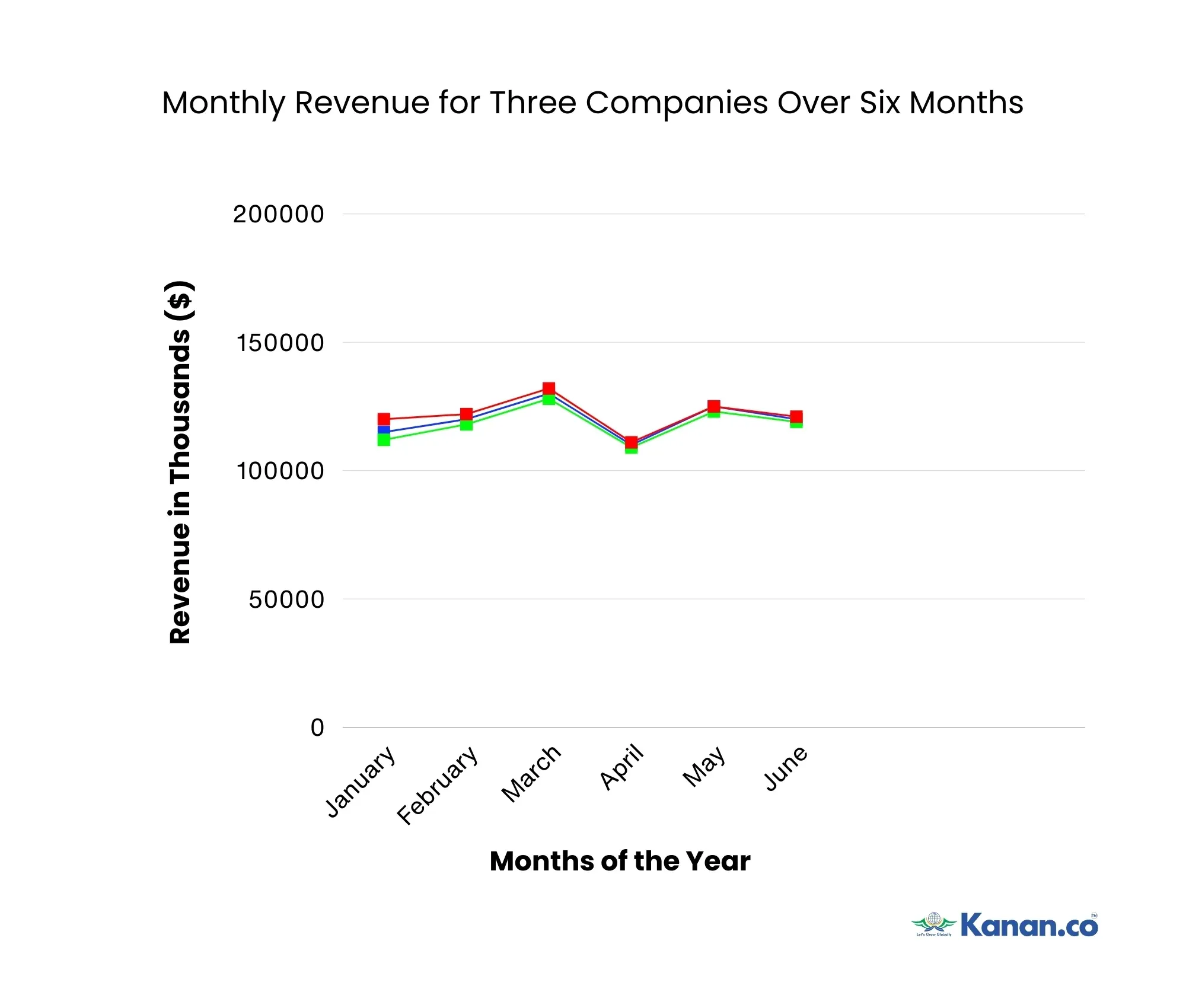
If the average monthly revenue for Company A over the six months is $120,000, and the revenues for Company B and Company C are consistently within 10% of Company A’s revenue each month, which of the following statements is false?
Options:
A) Company A had the highest revenue in at least four out of the six months.
B) Company B's revenue was never more than 5% lower than Company A's revenue.
C) The total revenue for Company C over the six months was higher than that of Company A.
D) The difference between the highest and lowest monthly revenue for Company B is greater than $15,000.
Solution:
1. Calculate the total revenue for each company:
Total revenue for Company A:
$115,000 + $120,000 + $130,000 + $110,000 + $125,000 + $120,000 = $720,000
Total revenue for Company B:
$112,000 + $118,000 + $128,000 + $109,000 + $123,000 + $119,000 = $709,000
Total revenue for Company C:
$120,000 + $122,000 + $132,000 + $111,000 + $125,000 + $121,000 = $731,000
2. Calculate the average revenue for Company A:
Average revenue for Company A: $720,000 / 6 = $120,000
3. Analyze and evaluate each option:
- Option A: Company A had the highest revenue in three months (March, May, and June), but not in four months, making this option false.
- Option B: Company B's revenue is consistently within 5% of Company A’s revenue each month, which is within the acceptable range, making this statement true.
- Option C: The total revenue for Company C is $731,000, which is higher than Company A’s total of $720,000, making this statement true.
- Option D: The difference between the highest and lowest revenue for Company B is $128,000 - $109,000 = $19,000, which is indeed greater than $15,000, making this option true.
Correct Answer: Option A is the correct answer, as it is the only false statement.
Explanation:
In this solution, the key step is to compare the revenues across different months and determine which statement is false. Company A does not have the highest revenue in four months, making Option A the false statement. All other statements are true based on the data provided.
Practice Questions on Scatterplots
6. A market analyst studied 60 retail stores to examine how their monthly sales (in thousands of dollars) were related to the amount of money spent on advertising (in thousands of dollars) over a six-month period. The analyst developed an advertising index, measured in “units,” based on the intensity and frequency of each store’s advertising efforts. The data, along with the trend line, are displayed in the scatterplot below.
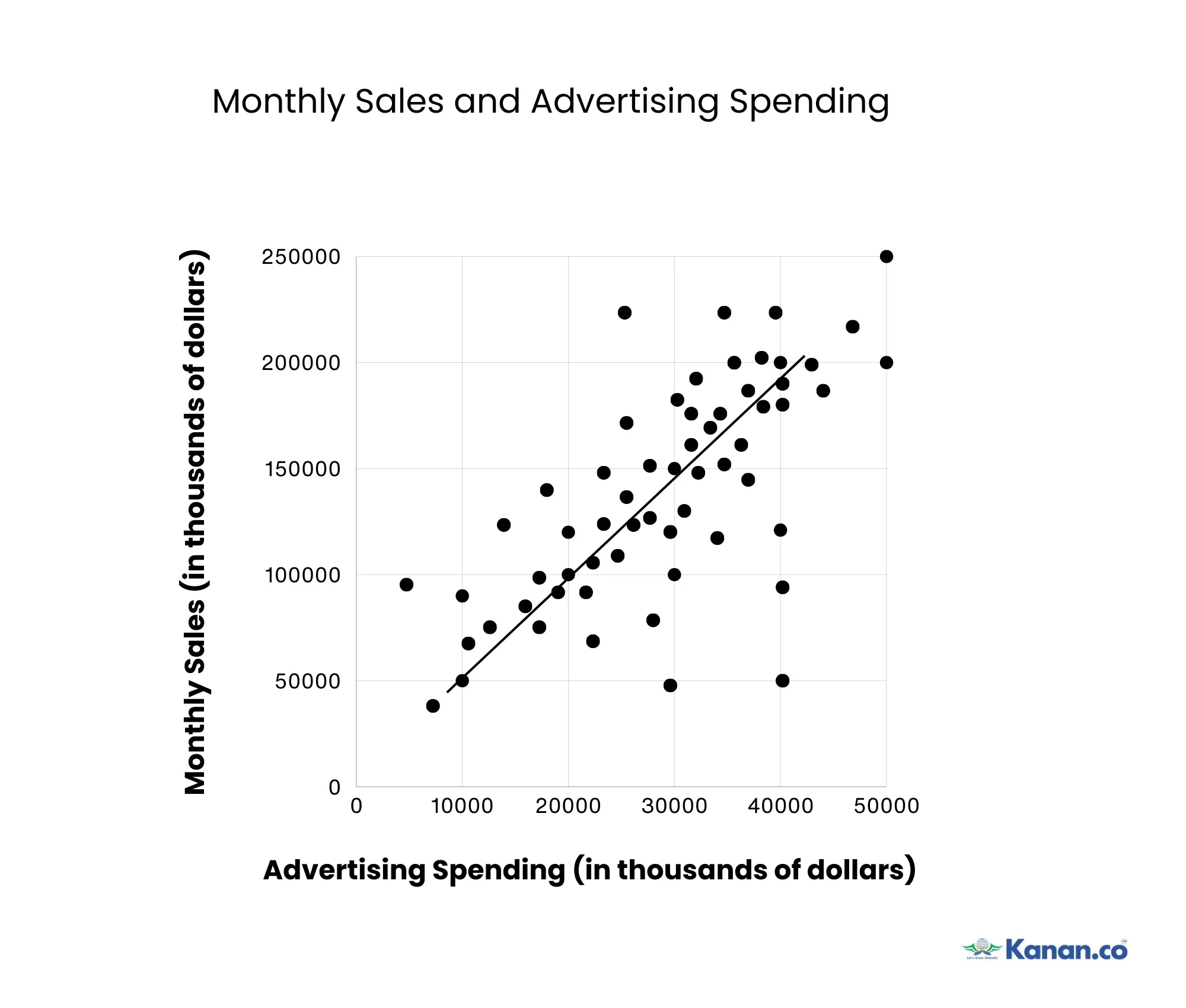
Based on the scatterplot, which of the following statements is most likely true?
Options:
A) Stores with higher advertising spending consistently had higher sales.
B) The trend line indicates a positive correlation between advertising spending and sales.
C) The majority of stores had sales above $150,000 regardless of their advertising spending.
D) The trend line suggests that doubling the advertising spending will double the sales.
Solution:
Analyze the trend line and data points:
The trend line is positively sloping, which indicates that as advertising spending increases, monthly sales also tend to increase.
Evaluate each option:
- Option A: While higher advertising spending is associated with higher sales, the scatterplot shows variability, meaning not all stores with higher spending have consistently higher sales. Therefore, this option is incorrect.
- Option B: The trend line indicates a positive correlation, making this statement correct.
- Option C: The majority of stores do not have sales above $150,000 regardless of advertising spending. The data shows a range of sales values, so this option is incorrect.
- Option D: The trend line suggests a positive correlation, but it does not imply that doubling the advertising spending will necessarily double the sales, so this option is incorrect.
Correct Answer: B) The trend line indicates a positive correlation between advertising spending and sales.
Explanation:
This scatterplot analysis requires understanding the relationship between two variables: advertising spending and monthly sales. The positive trend line indicates that, in general, as stores spend more on advertising, their sales tend to increase, showing a positive correlation. This type of question is likely to appear on the GRE as it assesses your ability to interpret scatterplots and understand the implications of trend lines, critical skills in data analysis.
Practice Questions on Histograms
7. A researcher collected data on the number of daily steps walked by 50 participants. The data is displayed in the histogram below. Each bar represents a range of daily steps, with the height of the bar showing the number of participants who fall within that range.
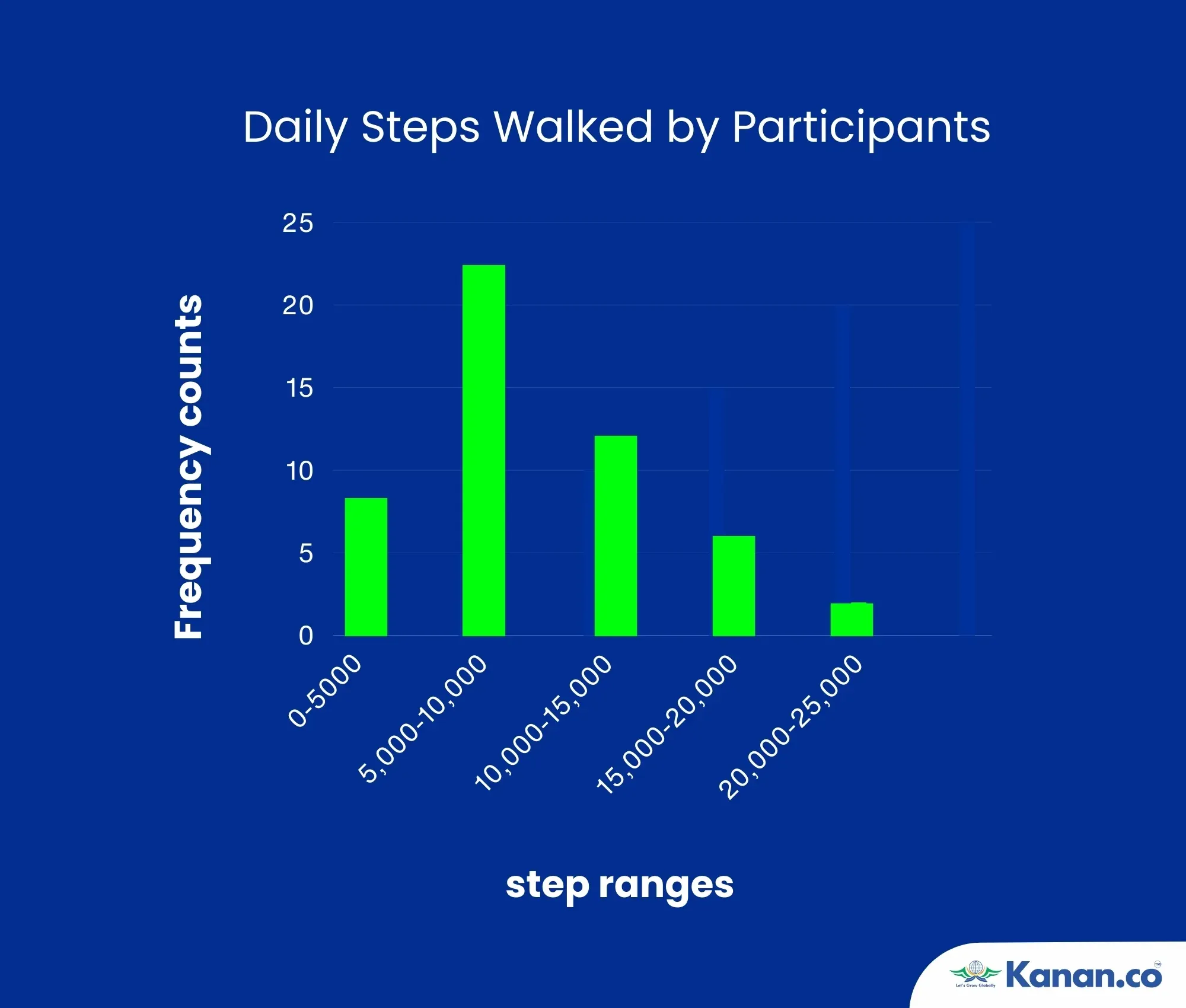
Based on the histogram, find the total number of participants who walk between 5,000 and 10,000 steps per day and identify the range with the smallest number of participants.
Options:
A) 20 participants walk between 5,000 and 10,000 steps; the range with the smallest number is 15,000-20,000 steps.
B) 22 participants walk between 5,000 and 10,000 steps; the range with the smallest number is 20,000-25,000 steps.
C) 24 participants walk between 5,000 and 10,000 steps; the range with the smallest number is 5,000-10,000 steps.
D) 18 participants walk between 5,000 and 10,000 steps; the range with the smallest number is 0-5,000 steps.
Solution:
Determine the Total Number of Participants Walking Between 5,000 and 10,000 Steps:
From the histogram, the bar for the 5,000-10,000 steps range reaches up to 22 participants.
Identify the Range with the Smallest Number of Participants:
The smallest bar is for the 20,000-25,000 steps range with a height of 2 participants.
On evaluating each option, Option B holds true as the number of participants and smallest range match.
Correct Answer: B) 22 participants walk between 5,000 and 10,000 steps; the range with the smallest number is 20,000-25,000 steps.
Explanation:
In this histogram question, understanding the distribution of participants across different step ranges is key. By accurately reading the heights of the bars and identifying the number of participants within specific ranges, you can determine the correct answer. This approach is crucial for interpreting histograms in the GRE, as it tests your ability to analyze and understand data distributions effectively.
Practice Questions on Time Plots
8. A researcher recorded the monthly sales figures for a small company over a year. The data is displayed in the time plot below, showing sales in thousands of dollars.
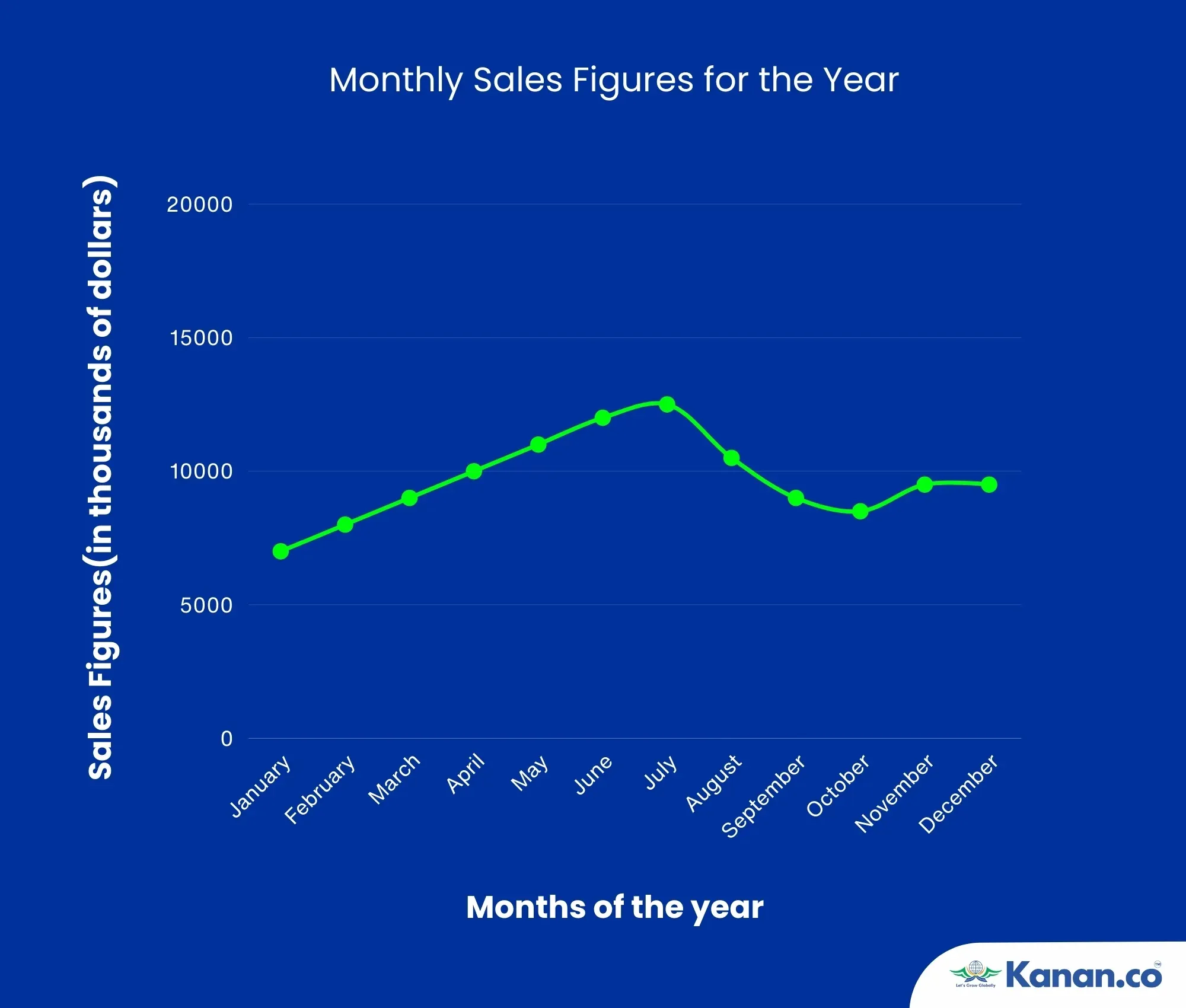
Based on the time plot, determine the following:
What was the average monthly sales figure for the first six months of the year?
In which month did the sales peak, and what was the sales figure for that month?
Options:
A) Average sales for the first six months: $8,000; Peak month: June with $12,000.
B) Average sales for the first six months: $9,00; Peak month: May with $15,000.
C) Average sales for the first six months: $9,500; Peak month: August with $12,500.
D) Average sales for the first six months: $8,500; Peak month: July with $13,000.
Solution:
1. Calculate the Average Monthly Sales for the First Six Months:
Add the sales figures from January to June:
January: $7,000
February: $8,000
March: $9,000
April: $10,000
May: $11,000
June: $12,000
Total Sales for First Six Months = $7,000 + $8,000 + $9,000 + $10,000 + $11,000 + $12,000 = $57,000
Average Sales = $57,000 / 6 = $9,500
2. Identify the Peak Month and Its Sales Figure:
From the time plot, the peak sales figure is in August at $12,500.
On evaluating each option, Option C holds true as Average Monthly Sales and Peak Month with its Sales match.
Correct Answer: Option C. Average sales for the first six months: $9,500; Peak month: August with $12,500.
Explanation:
In this time plot question, you are required to calculate the average value for a specified time period and identify the highest value within a time series. Accurate reading and interpretation of the time plot are essential for deriving these metrics.
Preparation Tips and Strategies for GRE Data Analysis
To excel in GRE Data Analysis, it’s essential to employ effective strategies and preparation techniques. Here are some key tips to help you master data interpretation questions:
- Read the Question First: Before answering, read the question clearly and understand the data provided to avoid confusion and save time.
- Examine Graphs and Data Carefully: Pay close attention to what the x-axis and y-axis represent, and ensure you understand the units and parameters used.
- Always Take Notes: Write down figures and calculations to avoid errors and make complex data easier to manage.
- Look for Patterns: Identify correlations and trends in the data to simplify the interpretation process and reduce confusion.
- Learn to Approximate Values: Use approximation for quick calculations, especially when dealing with uncomfortable or complex numbers.
- Be Cautious with Percentages: Distinguish between percentages and actual totals to avoid incorrect assumptions about the data.
- Learn Shortcuts and Formulas: Master shortcuts for mathematical operations to improve speed and accuracy in solving data interpretation questions.
To conclude, excelling in GRE Data Interpretation is essential for success in the Quantitative section. Focus on understanding these core concepts and practice extensively with varied question types to enhance your performance. Consistent preparation will be key to achieving a high score in this section.
Frequently Asked Questions (FAQs)
1. What is GRE Data Analysis?
GRE Data Interpretation or GRE Data Analysis is a component of the GRE (Graduate Record Examination) that evaluates your skills in interpreting and analyzing data presented in different formats, including tables, charts, and graphs.
2. In which GRE section are data analysis questions included?
Data analysis questions are included in the Quantitative Reasoning section of the GRE. This section features four types of questions and contains a total of 27 questions designed to assess a candidate's math skills.
3. How many data analysis questions are there on the GRE?
There are at least 6 data analysis questions on the GRE, out of a total of 40 questions in the Quantitative Reasoning section, accounting for about 15% of the entire math section. The GRE includes two Quantitative Reasoning sections, each with 20 questions.
4. How can I improve my data analysis skills for the GRE?
To enhance your data analysis skills for the GRE, practice regularly with sample questions, review key mathematical concepts, and utilize official prep materials and resources.
5. What skills are tested in GRE Data Analysis questions?
GRE Data Analysis questions assess your ability to interpret data accurately, identify trends and patterns, make inferences, and draw logical conclusions from the given information.
6. Are GRE Data Analysis scores reported separately from the overall GRE score?
No, GRE Data Analysis scores are not reported separately. They are included as part of the overall score for the Quantitative Reasoning section.
7. How does GRE Data Analysis differ from other sections of the GRE?
GRE Data Analysis stands out from other sections of the GRE because it specifically evaluates your ability to interpret and draw conclusions from data presented in various formats such as tables, graphs, and charts. Data Analysis a unique and crucial part of the GRE, as it tests your practical skills in handling real-world data, beyond just theoretical knowledge or basic calculations.
8. Can I use a calculator for GRE Data Analysis questions?
Yes, you are allowed to use a basic calculator for the Quantitative Reasoning section of the GRE, which includes data analysis questions. The on-screen calculator provided helps with arithmetic operations.
9. What is the difference between univariate and bivariate data analysis in the context of scatterplots?
Univariate data analysis involves examining a single variable's distribution and summary statistics, like mean and standard deviation. In contrast, bivariate data analysis involves exploring the relationship between two variables, often represented with scatterplots. Scatterplots help visualize how changes in one variable relate to changes in another, revealing patterns, trends, or correlations between them.

About Author Sravani Kota
Sravani is an enthusiastic author who is deeply passionate about continuous learning, writing, and reading. Her academic background includes a Bachelor's and Master's degree in engineering from JNTU, gaining expertise in technical English writing, paper publications, test preps like IELTS, GRE, SAT, TOEFL, etc., and study abroad services like SOP, LOR, etc. Her expertise in the education sector makes her an excellent resource for students seeking guidance and advice. In her leisure time, she enjoys spending quality time with family, watching popular TV shows like Stranger Things and Money Heist, and she also loves to travel, explore new places, and create videos of her experiences.
Kanan.co is a trusted study abroad consultancy offering comprehensive services, resources, and solutions for students and education institutions. We support students at every stage of their global education journey, ensuring a smooth and guided experience. Along with test preparation for IELTS, GRE, TOEFL, and SAT, we provide expert services such as SOP writing, visa guidance, accommodation support, scholarship assistance, and education loan support. Our expertise and commitment to excellence make us a reliable partner for students pursuing international education.
Sign Up for a Free GRE Demo Class!
Ace GRE Quant & Verbal with 320+ Score — Join Us!








Global Headquarters
Kanan Int EdTech Inc
320 Bay Street, Suite 321 (Spaces), Toronto ON, Canada M5B 1N9
Indian Headquarters
Kanan International Pvt. Ltd.
D-wing, 2nd Floor, Trident Complex, Ellora Park Vadiwadi Road, Vadodara, Gujarat 390007
IT/ Digital Campus
Kanan International Pvt. Ltd
Old, New No 3, 2nd Floor, 1A, Dr Sadasivam Rd, T. Nagar, Chennai, Tamil Nadu 600017
Our branches
- Bardoli
- Bharuch
- Chennai
- Dehradun
- Gurugram
- Himatnagar
- Karnal
- Nadiad
- Navsari
- Palanpur
- Rajkot
- Vadodara
- Valsad
- Vallabh Vidyanagar
- Vapi
Study Abroad
Test Prep
Top Universities
Consultants
IELTS Centers
GRE Centers
TOEFL Centers
SAT Centers
Language Courses in Vadodara
SOP Blogs
Featured Blogs
Study Abroad Consultants in Chennai
Study Abroad Consultants in Surat
Study Abroad Consultants in Navsari
Study Abroad Consultants in Bardoli
Study Abroad Consultants in Ahmedabad
Study Abroad Consultants in Anand
Study Abroad Consultants in Khanna
Study Abroad Consultants in Nadiad
Study Abroad Consultants in Vadodara
Study abroad consultants in Valsad
Copyright © 2026 KANAN.CO All rights reserved.