- Study Abroad
- / ielts
- / improving patient safety reading answers
Improving Patient Safety Reading Answers


Author
16-09-2025

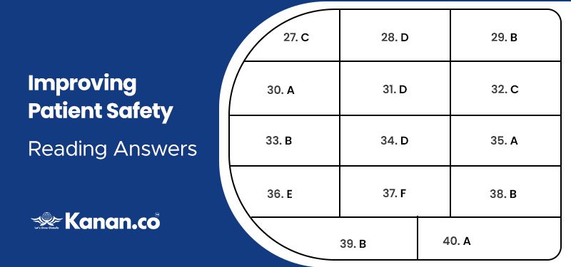
In this article, we have given, Improving Patient Safety reading practice test with questions and answers along with explanations. This passage has 14 questions in 3 different question forms namely- 6 questions as matching features, 5 questions as notes completion and 3 questions as multiple choice questions forms.
Check out our YouTube Channel to Practice Full-Length IELTS Reading Tests Daily

Table of contents:
- Solution for Improving patient safety
- Improving patient safety IELTS reading practice test
- Passage
- Questions
- Answers with explanations
Solution for Improving Patient Safety
We have given Improving patient safety reading answers, in the table given below.

Answer Table
| 27. C | 30. A | 33. B | 36. E | 39. B |
| 28. D | 31. D | 34. D | 37. F | 40. A |
| 29. B | 32. C | 35. A | 38. B |
Improving Patient Safety IELTS reading practice test- Exam Review
In this article we have provided Improving patient safety IELTS reading answers. This article will help to be distinguished in the IELTS reading practice to challenge your reading skill and read the given passage to answer the questions.
Passage
We have given Improving patient safety reading answers with location. Go through the given passage carefully and answer the questions.
Improving Patient Safety reading answers
Packaging
One of the most prominent design issues in pharmacy is that of drag packaging and patient information leaflets (Pits). Many letters have appeared in The Journal’s letters pages over the years from pharmacists dismayed at the designs of packaging that are “accidents waiting to happen”.
Packaging design in the pharmaceutical industry is handled by either in-house teams or design agencies. Designs for over-the-counter medicines, where characteristics such as attractiveness and distinguishing-ability are regarded as significant, are usually commissioned from design agencies. A marketing team will prepare a brief and the designers will come up with perhaps six or seven designs. These are whittled down to two or three that might be tested on a consumer group. In contrast, most designs for prescription-only products are created in-house. In some cases, this may simply involve applying a company’s house design (ie, logo, colour, font, etc). The chosen design is then handed over to design engineers who work out how the packaging will be produced.
Design considerations
The author of the recently published “Information design for patient safety,” Thea Swayne, tracked the journey of a medicine from manufacturing plant, through distribution warehouses, pharmacies and hospital wards, to patients’ homes. Her book highlights a multitude of design problems with current packaging, such as look-alikes and sound-alikes, small type sizes and glare on blister foils. Situations in which medicines are used include a parent giving a cough medicine to a child in the middle of the night and a busy pharmacist selecting one box from hundreds. It is argued that packaging should be designed for moments such as these. “Manufacturers are not aware of the complex situations into which products go. As designers, we are interested in not what is supposed to happen in hospital wards, but what happens in the real world,” Ms Swayne said.
Incidents where vein has been injected intrathecally instead of spine are a classic example of how poor design can contribute to harm. Investigations following these tragedies have attributed some blame to poor typescript.
Safety and compliance
Child protection is another area that gives designers opportunities to improve safety. According to the Child Accident Prevention Trust, seven out of 10 children admitted to hospital with suspected poisoning have swallowed medicines. Although child-resistant closures have reduced the number of incidents, they are not: fully child-proof. The definition of such a closure is one that not more than 15 percent of children aged between 42 and 51 months can open within five minutes. There is scope for improving what is currently available, according to Richard Mawle, a freelance product designer. “Many child-resistant packs are based on strength. They do not necessarily prevent a child from access, but may prevent people with a disability,” he told The Journal. “The legal requirements are there for a good reason, but they are not good enough in terms of the users,” he said. “Older people, especially those with arthritis, may have the same level of strength as a child,” he explained, and suggested that better designs could rely on cognitive skills (eg, making the opening of a container a three-step process) or be based on the physical size of hands.
Mr. Mawle worked with GlaxoSmithKline on a project to improve compliance through design, which involved applying his skills to packaging and PILs. Commenting on the information presented, he said: “There can be an awful lot of junk at the beginning of PILs. For example, why are company details listed towards the beginning of a leaflet when what might be more important for the patient is that the medicine should not be taken with alcohol?”
Design principles and guidelines
Look-alike boxes present a potential for picking errors and an obvious solution would be to use colours to highlight different strengths. However, according to Ms.Swayne, colour differentiation needs to be approached with care. Not only should strong colour contrasts be used, but designating a colour to a particular strength (colour coding) is not recommended because this could lead to the user not reading the text on a box.
Design features can provide the basis for lengthy debates. For example, one argument is that if all packaging is white with black lettering, people would have no choice but to read every box carefully. The problem is that trials of drug packaging design are few—common studies of legibility and comprehensibility concern road traffic signs and visual display units. Although some designers take results from such studies into account, proving that a particular feature is beneficial can be difficult. For example, EU legislation requires that packaging must now include the name of the medicine in Braille but, according to Karel van der Waarde, a design consultant to the pharmaceutical industry, “it is not known how much visually impaired patients will benefit nor how much the reading of visually able patients will be impaired”.
More evidence might, however, soon be available. EU legislation requires PILs to reflect consultations with target patient groups to ensure they are legible, clear and easy to use. This implies that industry will have to start conducting tests. Dr. van der Waarde has performed readability studies on boxes and PILs for industry. A typical study involves showing a leaflet or package to a small group and asking them questions to test understanding. Results and comments are used to modify the material, which is then tested on a larger group. A third group is used to show that any further changes made are an improvement. Dr. van der Waarde is, however, sceptical about the legal requirements and says that many regulatory authorities do not have the resources to handle packaging information properly. “They do not look at the use of packaging in a practical context—they only see one box at a time and not several together as pharmacists would do,” he said.
Innovations
The RCA innovation exhibition this year revealed designs for a number of innovative objects. “The popper”, by Hugo Glover, aims to help arthritis sufferers remove tablets from blister packs, and “pluspoint”, by James Cobb, is an adrenaline auto-injector that aims to overcome the fact that many patients do not carry their auto-injectors due to their prohibitive size. The aim of good design, according Roger Coleman, professor of inclusive design at the RCA, is to try to make things more user-friendly as well as safer. Surely, in a patient-centred health system, that can only be a good thing. “Information design for patient safety” is not intended to be mandatory. Rather, its purpose is to create a basic design standard and to stimulate innovation. The challenge for the pharmaceutical industry, as a whole, is to adopt such a standard.
Questions
Questions 27-32
- Look at the following statements (Questions 27-32) and the list of people or organizations below.
- Match each statement with the correct person or organisation, A-D.
- Write the correct letter, A-D, in boxes 27-32 on your answer sheet.
- NB You may use any letter more than once.
A Thea Swayne
B Children Accident Prevention Trust
C Richard Mawle
D Karel van der Waarde
27. Elderly people may have the same problem with children if the lids of containers require too much strength to open.
28. Adapting packaging for the blind may disadvantage the sighted people.
29. Specially designed lids cannot eliminate the possibility of children swallowing pills accidentally.
30. Container design should consider situations, such as drug used at home.
31. Governing bodies should investigate many different container cases rather than individual ones.
32. Information on the list of a leaflet hasn’t been in the right order.
Questions 33-37
- Complete the notes using the list of words, A-G, below.
- Write the correct letter, A-G, in boxes 33-37 on your answer sheet.
Packaging in Pharmaceutical Industry
Designs for over-the-counter medicines
First, 33______ make the proposal, then pass them to the 34______ Finally, these designs will be tested by 35_____
Prescription-only
First, the design is made by 36______ and then subjected to 37_____
A consumers
B marketing teams
C pharmaceutical industry
D external designers
E in-house designers
F design engineers
G pharmacist
Questions 38-40
- Choose the correct letter, A, B, C or D.
- Write the correct letter in boxes 38-40 on your answer sheet.
38. What may cause the accident in “design container”?
A a print error
B style of print
C wrong label
D the shape of the bottle
39. What do people think about the black and white only print?
A Consumers dislike these products.
B People have to pay more attention to the information.
C That makes all products look alike.
D Sighted people may feel it is more helpful.
40. Why does the writer mention “popper” and “pluspoint”?
A to show that container design has made some progress
B to illustrate an example of inappropriate design which can lead to accidents
C to show that the industry still needs more to improve
D to point out that consumers should be more informed about the information
Answers for Improving Patient Safety with explanation
We have given Improving Patient Safety reading answers with explanation, this will help you to identify your mistakes in the answering process.
27. Answer: C
Explanation: “Older people, especially those with arthritis, may have the same level of strength as a child,” he explained, and suggested that better designs could rely on cognitive skills (eg, making the opening of a container a three-step process) or be based on the physical size of hands. In these lines it is proven that according to Richard Mawle that Elderly people may have the same problem with children if the lids of containers require too much strength to open. Hence the given answer is located in the 11-14 lines under the paragraph Safety and compliance.
28. Answer: D
Explanation: “According to Karel van der Waarde, a design consultant to the pharmaceutical industry, “it is not known how much visually impaired patients will benefit nor how much the reading of visually able patients will be impaired”. From this line it is proven that adapting packaging for the blind may disadvantage the sighted people. Hence the given answer is located in the last 2 lines of 2nd stanza under design principles and guidelines.
29. Answer: B
Explanation: “According to the Child Accident Prevention Trust, seven out of 10 children admitted to hospital with suspected poisoning have swallowed medicines. Although child-resistant closures have reduced the number of incidents, they are not: fully child-proof”. From these lines it is proven that Specially designed lids cannot eliminate the possibility of children swallowing pills accidentally. Hence the given answer is located in the 2-4 lines under the paragraph Safety and compliance.
30. Answer: A
Explanation: “Manufacturers are not aware of the complex situations into which products go. As designers, we are interested in not what is supposed to happen in hospital wards, but what happens in the real world,” Ms Swayne said. From these lines it is proven that container design should consider situations, such as drug use at home. Hence the given answer is located in the last 4 lines of 1st stanza under design considerations.
31. Answer: D
Explanation: Dr. van der Waarde is, however, sceptical about the legal requirements and says that many regulatory authorities do not have the resources to handle packaging information properly. “They do not look at the use of packaging in a practical context—they only see one box at a time and not several together as pharmacists would do,” he said. From these lines it is clear that governing bodies should investigate many different container cases rather than individual ones.Hence the given answer is located in the last 4 lines of the 3rd stanza under design principles and guidelines.
32. Answer: C
Explanation: “There can be an awful lot of junk at the beginning of PILs. For example, why are company details listed towards the beginning of a leaflet when what might be more important for the patient is that the medicine should not be taken with alcohol?” from this line it is clear that information on the list of a leaflet hasn’t been in the right order. Hence the given answer is located in the last 4 lines of the 3rd stanza under Safety and compliance.
33. Answer: B
Explanation: A marketing team will prepare a brief. From this line it is clear that the first marketing team will prepare a brief. Hence the given answer is located in the 4th line of the 2nd stanza under packaging.
34. Answer: D
Explanation: The designers will come up with perhaps six or seven designs. From this line it is clear that, after the brief it will pass them to the designers. Hence the given answer is located in the 4-5 lines of the 2nd stanza under packaging.
35. Answer: A
Explanation: These are whittled down to two or three that might be tested on a consumer group. From this line it is clear that finally these designs will be tested by consumers. Hence the given answer is located in the 5-6 lines of the 2nd stanza under packaging.
36. Answer: E
Explanation: In contrast, most designs for prescription-only products are created in-house. In some cases, this may simply involve applying a company’s house design (ie, logo, colour, font, etc). From this line it is clear that in prescription first the design is made by in-house designers. Hence the given answer is located in the 6-8 lines of the 2nd stanza under packaging.
37. Answer: F
Explanation: The chosen design is then handed over to design engineers who work out how the packaging will be produced. From this line it is clear that after designing it will be subjected to design engineers. Hence the given answer is located in the 8-9 lines of the 2nd stanza under packaging.
38. Answer: B
Explanation: Look-alike boxes present a potential for picking errors and an obvious solution would be to use colours to highlight different strengths. However, according to Ms.Swayne, colour differentiation needs to be approached with care. Not only should strong colour contrasts be used, but designating a colour to a particular strength (colour coding) is not recommended because this could lead to the user not reading the text on a box. From this line it is clear the style of print may cause the accident in desgin container. Hence the given answer is located in the 1st stanza under design principles and guidelines.
39. Answer: B
Explanation: For example, one argument is that if all packaging is white with black lettering, people would have no choice but to read every box carefully. From this line it is clear that people have to pay more attention to the information about the black and white print. Hence the given answer is located in the 1-3 lines of 2nd stanza under design principles and guidelines.
40. Answer: A
Explanation: “The RCA innovation exhibition this year revealed designs for a number of innovative objects” and “Rather, its purpose is to create a basic design standard and to stimulate innovation. The challenge for the pharmaceutical industry, as a whole, is to adopt such a standard”. From these lines it is clear that the writer mention “popper” and “pluspoint” to show that container design has made some progress. Hence the given answer is located in the first 2 lines and last 3 lines under the paragraph Innovation.
Other reading answers

About Author Manimegalai Samidurai
Manimegalai is a multifaceted professional, excelling as an author, writer, and study-abroad expert. Her vast knowledge of English proficiency exams, including IELTS, GRE, SAT, and PTE, and exceptional content writing skills make her a go-to resource for students seeking guidance and support in their foreign education journey. She is a trusted authority in writing content related to these test-prep exams, making her an invaluable resource for those seeking guidance. With her well-researched and informative blogs, articles, and study materials, Manimegalai has helped countless students achieve their desired band scores and get admissions to top-notch colleges & universities in countries like Canada, USA, UK, Australia, Ireland, etc.
Kanan.co is a trusted study abroad consultancy offering comprehensive services, resources, and solutions for students and education institutions. We support students at every stage of their global education journey, ensuring a smooth and guided experience. Along with test preparation for IELTS, GRE, TOEFL, and SAT, we provide expert services such as SOP writing, visa guidance, accommodation support, scholarship assistance, and education loan support. Our expertise and commitment to excellence make us a reliable partner for students pursuing international education.
Free Online Mock Test 2026
Practice our mock test worth Rs. 25000 for Free and know your IELTS score!








Global Headquarters
Kanan Int EdTech Inc
320 Bay Street, Suite 321 (Spaces), Toronto ON, Canada M5B 1N9
Indian Headquarters
Kanan International Pvt. Ltd.
D-wing, 2nd Floor, Trident Complex, Ellora Park Vadiwadi Road, Vadodara, Gujarat 390007
IT/ Digital Campus
Kanan International Pvt. Ltd
Old, New No 3, 2nd Floor, 1A, Dr Sadasivam Rd, T. Nagar, Chennai, Tamil Nadu 600017
Our branches
- Bardoli
- Bharuch
- Chennai
- Dehradun
- Gurugram
- Himatnagar
- Karnal
- Nadiad
- Navsari
- Palanpur
- Rajkot
- Vadodara
- Valsad
- Vallabh Vidyanagar
- Vapi
Study Abroad
Test Prep
Top Universities
Consultants
IELTS Centers
GRE Centers
TOEFL Centers
SAT Centers
Language Courses in Vadodara
SOP Blogs
Featured Blogs
Study Abroad Consultants in Chennai
Study Abroad Consultants in Surat
Study Abroad Consultants in Navsari
Study Abroad Consultants in Bardoli
Study Abroad Consultants in Ahmedabad
Study Abroad Consultants in Anand
Study Abroad Consultants in Khanna
Study Abroad Consultants in Nadiad
Study Abroad Consultants in Vadodara
Study abroad consultants in Valsad
Copyright © 2026 KANAN.CO All rights reserved.