IELTS Writing Task 1 Line Graph: 6 Sample Answers


Author
23-06-2025


This post offers Task 1 line graph 6 sample answers with a detailed explanation. Practise these questions and improve your skills in line charts and graphs.
Check Out our YouTube Channel to Practice Full-Length IELTS Listening Tests Daily

IELTS Writing Task 1 Line Graph Sample Answer 1
The line graph below shows the average monthly temperatures in three major cities.
|
You should spend about 20 minutes on this task. The line graph below shows the average monthly temperatures in three major cities. Summarise the information by selecting and reporting the main features, and make comparisons where relevant. You should write at least 150 words. |

Model essay for Line graph showing temperature:
The line graph illustrates changes in average temperatures in a month in three different cities: Paris, Dubai and Sydney. The temperature is displayed in Celsius degrees.
According to the graphic presentation, the weather report in Sydney is not the same as in Dubai and Paris. Moreover, Paris is the coldest city compared to Dubai and Sydney.
To start with, the temperature range in Paris never rises beyond 20 degrees. Whereas the temperature range in Dubai hardly reduced from its average level, except during January (19 degrees C). Nevertheless, the temperatures in Paris and Dubai still have some commonalities, as their temperatures rise gradually at the beginning of the year and reach the maximum of 20 and 36 respectively in August. Later, both temperatures will reduce sharply.
When it comes to Sydney, the place experiences a 24-degree temperature in January. Then immediately after that, the temperature drops to the lowest point of 14 degrees in July. Similarly, at the end of the year, the temperature shoots up to 23 degrees.
(169 words)
IELTS Writing Task 1 Line Graph Sample Answer 2
The graph below shows average carbon dioxide (CO2) emissions per person in the United Kingdom, Sweden, Italy and Portugal between 1967 to 2007.
|
You should spend about 20 minutes on this task. The graph below shows average carbon dioxide (Co2) emissions per person in the United Kingdom, Sweden, Italy and Portugal between 1967 to 2007. Summarise the information by selecting and reporting the main features, and make comparisons where relevant. You should write at least 150 words. |

Model essay for the line graph shows average carbon dioxide emissions per person:
This IELTS writing line graph reveals the average carbon dioxide emissions in metric tonnes in four major countries: the UK, Sweden, Italy and Portugal during the period of 1967 to 2007.
On the whole, carbon emissions swept down in the UK and Sweden in terms of per capita, but they rose in Italy and Portugal in the last 40 years.
Besides a downward trend from 11 to 9 metric tonnes, carbon emissions in the UK seem to be still over these four decades in comparison to the other three countries. Sweden’s emissions rose steadily from nearly 9 metric tonnes in 1967 and reached a maximum of 10.5 metric tonnes in 1977, which is 10 years. Then it decreased dramatically to about 5.5 metric tonnes in the year 2007. It eventually made Sweden the lowest carbon emitting country in per capita emissions out of other countries in that year.
During 1967 and 2007, an individual’s average emissions in Italy contributed gradually from 4.5 to nearly 8 metric tonnes of carbon dioxide. Similarly, in Portugal, an individual’s carbon emissions amounted to 1.5 metric tonnes in 1967. Over the same period, the country’s emissions surmounted to an optimum level similar to that of Sweden’s by 2007, at a rate of 5.5 metric tonnes.
(213 words)
IELTS Writing Task 1 Line Graph Sample Answer 3
The graph shows underground station passenger numbers in London.
|
You should spend about 20 minutes on this task. The graph shows Underground Station passenger numbers in London. Summarise the information by selecting and reporting the main features, and make comparisons where relevant. You should write at least 150 words. |

Model essay for the line graph shows underground station passenger numbers in London:
The line graph provides information about the numbers of commuters using the underground station in London around the clock of a typical day. Being said that, the busiest times at the underground station would be 8:00 am, followed by 6:00 pm.
The highest numbers of passengers who commute using the underground station are in the morning, 8:00 am, to be specific. Notably, there is a sharp increase in the number of people between 6.00 am, and 8.00 am when nearly 400 people travel through the underground station. After that, the number dropped to below 200 at 10.00 am. Then again, it rose between 11.00 am and 3.00 pm where about 300 people travelled using the underground station with slight fluctuations.
During the afternoon, there was a downward trend with less than 100 people using the station at 4:00 pm. In the evening, at 6:00 pm, this number touched almost 380. Again after 7:00 pm, the total number of riders reduced significantly and varied for the last two hours from 8:00 pm to 10:00 pm.
Overall, the number of people in London keeps the underground station busy at the beginning of the day and in the early evening.
(210 words)
IELTS Writing Task 1 Line Graph Sample Answer 4
The line graph shows visits to and from the UK.
|
You should spend about 20 minutes on this task. The line graph shows visits to and from the UK from 1979 to 1999, and the bar graph shows the most popular countries visited by UK residents in 1999. Summarise the information by selecting and reporting the main features and make comparisons where relevant. Write at least 150 words. |

Read the line graph essay here
IELTS Writing Task 1 Line Graph Sample Answer 5
The line graph shows Paris metro station passengers.
|
You should spend about 20 minutes on this task. The line graph shows Paris metro station passengers. Summarise the information by selecting and reporting the main features and make comparisons where relevant. Write at least 150 words. |
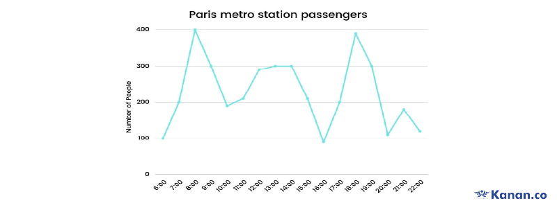
Read the line graph essay here
IELTS Writing Task 1 Line Graph Sample Answer 6
The line graph shows thefts per thousand.
|
You should spend about 20 minutes on this task. The line graph shows thefts per thousand vehicles in four countries between 1990 and 1999. Summarise the information by selecting and reporting the main features and make comparisons where relevant. Write at least 150 words. |
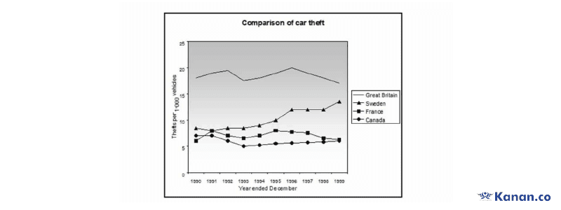
Read the line graph essay here
What is Task 1 Line Graph?
Task 1 line graph (also called a line chart) is a graphical representation of information. It requires you to understand how this information changes over time along the X and Y axis and describe upward/downward trends in an essay of 150 words. Line graphs or line charts are one of the six question types in IELTS Writing Task 1.
Beginners looking for the line graph PDF can download it here. This PDF file contains the most recent sample answers that can help you score Band 9.

About Author Roshan Sunthar
Roshan Sunthar is a study abroad expert as well as a renowned writer and author in international education. His academic excellence and 5+ years of work experience give him in-depth knowledge of international standardised exams and test preparation in IELTS, TOEFL, GRE, PTE, SAT, etc. The study materials he prepares incorporate exam-like questions. He’s also an expert in writing Statement of Purposes (SOPs) and Letter of Recommendations (LORs) for college admissions. He usually spends his leisure time watching English classics and documentaries, travelling, etc.
Kanan.co is a trusted study abroad consultancy offering comprehensive services, resources, and solutions for students and education institutions. We support students at every stage of their global education journey, ensuring a smooth and guided experience. Along with test preparation for IELTS, GRE, TOEFL, and SAT, we provide expert services such as SOP writing, visa guidance, accommodation support, scholarship assistance, and education loan support. Our expertise and commitment to excellence make us a reliable partner for students pursuing international education.
Free Online Mock Test 2026
Practice our mock test worth Rs. 25000 for Free and know your IELTS score!








Global Headquarters
Kanan Int EdTech Inc
320 Bay Street, Suite 321 (Spaces), Toronto ON, Canada M5B 1N9
Indian Headquarters
Kanan International Pvt. Ltd.
D-wing, 2nd Floor, Trident Complex, Ellora Park Vadiwadi Road, Vadodara, Gujarat 390007
IT/ Digital Campus
Kanan International Pvt. Ltd
Old, New No 3, 2nd Floor, 1A, Dr Sadasivam Rd, T. Nagar, Chennai, Tamil Nadu 600017
Our branches
- Bardoli
- Bharuch
- Chennai
- Dehradun
- Gurugram
- Himatnagar
- Karnal
- Nadiad
- Navsari
- Palanpur
- Rajkot
- Vadodara
- Valsad
- Vallabh Vidyanagar
- Vapi
Study Abroad
Test Prep
Top Universities
Consultants
IELTS Centers
GRE Centers
TOEFL Centers
SAT Centers
Language Courses in Vadodara
SOP Blogs
Featured Blogs
Study Abroad Consultants in Chennai
Study Abroad Consultants in Surat
Study Abroad Consultants in Navsari
Study Abroad Consultants in Bardoli
Study Abroad Consultants in Ahmedabad
Study Abroad Consultants in Anand
Study Abroad Consultants in Khanna
Study Abroad Consultants in Nadiad
Study Abroad Consultants in Vadodara
Study abroad consultants in Valsad
Copyright © 2026 KANAN.CO All rights reserved.