IELTS writing task 1 sample answer


Author
23-06-2025


IELTS writing task 1 is a section of the IELTS test in which you need to write an essay of at least 150 words in 20 minutes. The question in the IELTS writing task 1 will be in the form of visual representation. The types of writing task 1 involves pie chart, line graph, bar chart, table chart, process diagram and map. This article will be the guidance of how to write the essay for each question type, as we’ve given the IELTS writing task 1 sample answer for all questions.
IELTS writing section will be evaluated by 4 marking criteria namely: task achievement, coherence and cohesion, lexical resource (vocabulary), and grammatical accuracy. To achieve a high band score in the IELTS writing task 1 you need to consider these factors. In this article we’ve given the IELTS writing task 1 sample answer for each question type.
Check Out our YouTube Channel to Practice Full-Length IELTS Listening Tests Daily

IELTS writing task 1 sample
Aiming for band 9? Here we’ve given the IELTS writing task 1 sample for all of the question types. In comparison with other sections of the IELTS test, one of the easier parts is the IELTS writing task 1 academic. Practice with the below writing task 1 sample answer to score better.
Pie Chart
You’re expected to write an essay by analysing the given pie chart. You’ll be given one, two or three pie charts which come with the percentage data or without percentage and just with numbers.
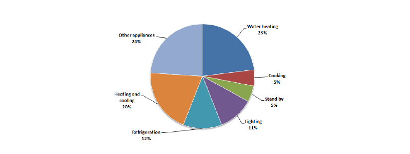
1. The first pie chart shows how energy is used in an average house in a European country. The second chart shows the percentage of greenhouse gas emissions from this energy use in this country.
Summarise the information by selecting and reporting the main features, and make comparisons where relevant.
Write at least 150 words.
The percentage of household energy use:
The percentage of greenhouse gas produced:

Sample Answer:
From the two given pie charts, one depicts the average energy usage in the house of an European country. Another pie chart shows the data of greenhouse gas emissions from the energy used in the country.
On the whole, heating and cooling systems and water heating consumes higher energy for the households and as well as produce a huge percentage of greenhouse gases.
According to the pie chart 1, more than 20% of the energy consumed for the water heating, heating and cooling system and other appliances of the household. And, in comparison with refrigeration, cooking and lighting attract less energy as the energy consumption of refrigeration is 12%. Finally, there is a 5% energy consumption happening in the standby mode.
From the pie chart 2, it is shown that the heating and cooling system emits the highest of 38 percent of greenhouse gases followed by the water heating 25%. The next least emission happened in the other appliances usage with 16%. Finally, refrigeration, cooking, lighting, standby are the least with below 10% emission.
(174 words)
2. The pie chart shows the amount of money that a children's charity located in the USA spent and received in one year.
Summarise the information by selecting and reporting the main features and make comparisons where relevant.
Write at least 150 words.
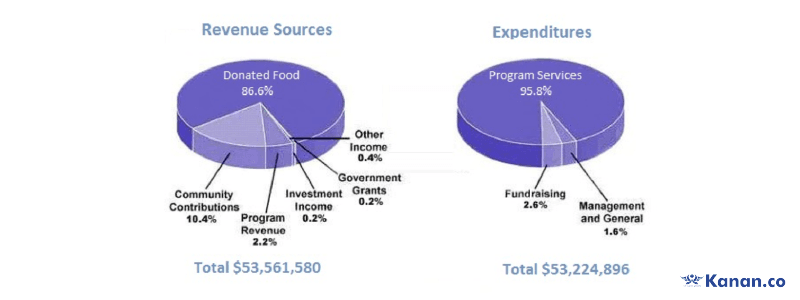
Check the writing task 1 sample answer pie chart 2 for the above pie chart.
3. The pie charts below show the different types of courses, which were followed by the students during the years of 1984, 1994 and 2004.
Summarise the information by selecting and reporting the main features and make comparisons where relevant.
Write at least 150 words.
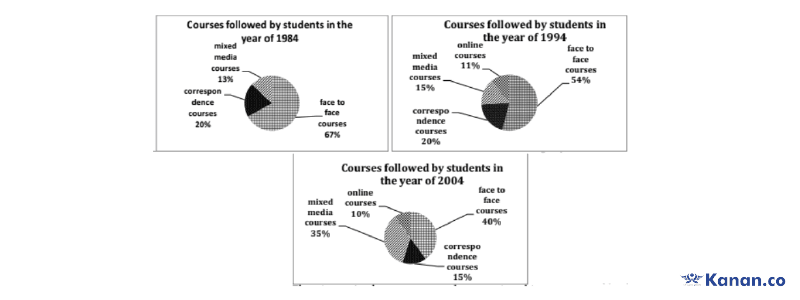
Check the writing task 1 sample answer pie chart 3 for the above pie chart.
4. The pie charts below show the online sales for retail sectors in New Zealand in 2003 and 2013.
Summarise the information by selecting and reporting the main features and make comparisons where relevant.
Write at least 150 words.
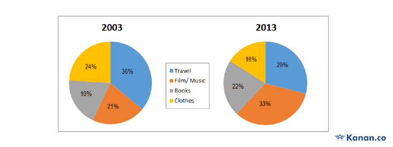
Check the writing task 1 sample answer pie chart 4 for the above pie chart.
5. The two pie charts show the percentage of the pollutants entering a particular part of ocean in 1997 and 2007.
Summarise the information by selecting and reporting the main features and make comparisons where relevant.
Write at least 150 words.

Check the writing task 1 sample answer pie chart 5 for the above pie chart.
Line Graph
Task 1 line graph will show the change in data over the period of time. In this line graph there will be an x axis which shows the time period and the y-axis shows the measurement. To understand better, you can check our other task 1 line graph sample answers.
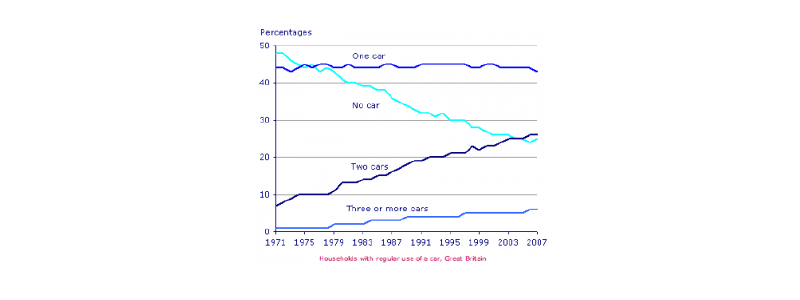
1. The graph below gives information about car ownership in Britain from 1971 to 2007.
Summarise the information by selecting and reporting the main features, and make comparisons where relevant.
You should write at least 150 words.
Sample Answer:
The line graph shows the information about the number of cars that a household of Great Britain owns in the period of 36 years.
Overall, between the period of 1971 to 2007, there were many changes in car ownership in Britain. The percentage of households having two cars rose, meanwhile the number of households without a car declined.
In 1970, nearly half of the families in Britain didn't own any car. But, 44% of households had one car. When it comes to households having more than 1 car, only 7% owned two cars and 2% of families had three or more cars.
Over the period of time, there was a drastic change in the usage of cars in Britain, as the percentage of households having no cars fell to 25% in 2007. While the proportion of families having two cars rose to 26% in 2007. And the families having three and more cars reached about 5% in 2007.
(165 words)
2. The line graph shows Paris metro station passengers.
Summarise the information by selecting and reporting the main features and make comparisons where relevant.
Write at least 150 words.
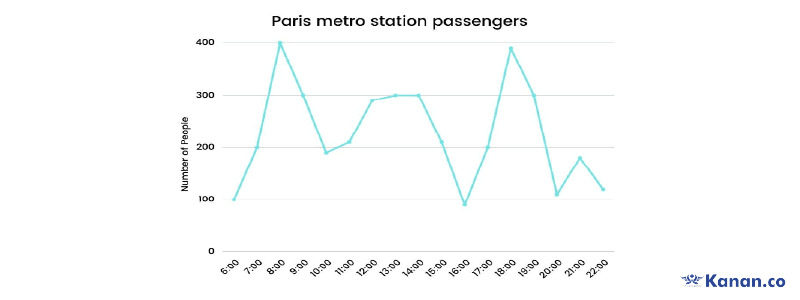
Check the writing task 1 sample answer line graph 2 for the above line graph.
3. The line graph shows thefts per thousand vehicles in four countries between 1990 and 1999.
Summarise the information by selecting and reporting the main features and make comparisons where relevant.
Write at least 150 words.
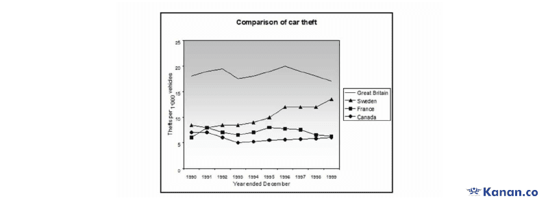
Check the writing task 1 sample answer line graph 3 for the above process diagram.
Map
In the task 1 map you’re required to compare the given two or three maps and write an essay about the development and the changes that took place in the map. You can check our writing task 1 map sample answer to get better understanding. Also check the samples given below.
1. The maps show changes that took place in Youngsville in New Zealand over a 25 year period from 1980 to 2005.
Summarise the information by selecting and reporting the main features and make comparisons where relevant.
Write at least 150 words.
Sample answer
The map shows the development that happened over 25 years in Youngsville, New Zealand. From 1980 to 2005, there were huge changes that were held in Youngsville.
Overall, many of the houses and trees are reconstructed with factories, warehouses and skyscrapers, stadium and other amenities.
In the northern side of the hospital, a new stadium and parking area were built. In 1980, there were many trees near the hospital which were removed to develop the facilities like swimming and others for the public. Near the school and airport, there are many houses and greenery which were situated in the year 1980, which were converted into factories and warehouses. Also, skyscrapers came into place in the year 2005 in the replacement of trees and houses.
While looking at the railway station there was a new marina was built and the railway track were extended towards the north direction of the hospital which is located near the newly developed stadium and parking.
(161 words)
2. The two maps below show an island, before and after the construction of some tourist facilities
Summarise the information by selecting and reporting the main features, and make comparisons where relevant.
Write at least 150 words.
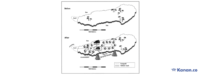
Check the writing task 1 sample answer map 1 for the above map.
Process Diagram
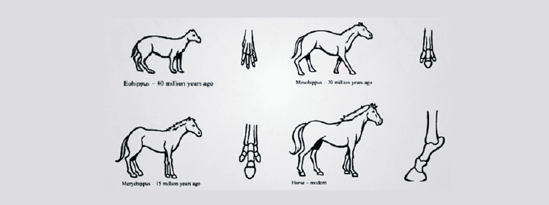
1. The diagram below shows the development of the horse over a period of 40 million years.
Write a report for a university lecturer describing the information shown below.
Sample Answer
The diagram depicts the evolution of the modern horse from Eohippus, Meohippus, Merychippus over 40 million years ago.
Overall, it is clear that in the 40 million years the emphasis of foot structure was the major development of horses.
Firstly, the ancestor Euohippus looks much smaller in size with the feet of four toes. After 10 million years ago the first transformation happened in the name of Meohippus. There was a visible difference in the size, the toes were reduced as three and the fur appeared in the back.
While in the second stage that is after 15 million years ago, there was not much difference. However, the development had taken place over the period like size was slightly larger, middle toes were developed, fur became thicker and tail became longer for the Merychippus.
But, in the modern horse there was a huge evolution in the foot structure. A complex and sturdy foot structure was developed which helps to balance the body weight. A long and thick fur appeared in the back of the neck and also the large tail which in contrast from its predecessors.
(191 words)
2. The diagrams below show the life cycle of the silkworm and the stages in the production of silk cloth.
Summarise the information by selecting and reporting the main features, and make comparisons where relevant.
Write at least 150 words.
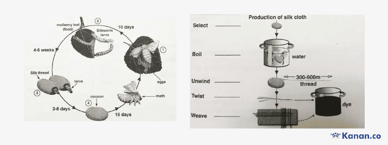
Check the writing task 1 sample answer process diagram 2 for the above process diagram.
3. The diagrams below show the process of producing olive oil.
Summarise the information by selecting and reporting the main features, and make comparisons where relevant.
Write at least 150 words.
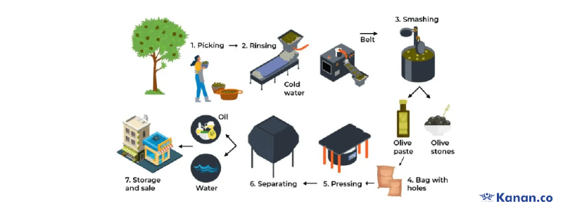
Check the writing task 1 sample answer process diagram 3 for the above process diagram.
4. The diagram below shows how the Australian Bureau of Meteorology collects up-to-the-minute information on the weather in order to produce reliable forecasts.
Summarise the information by selecting and reporting the main features, and make comparisons where relevant.
Write at least 150 words.
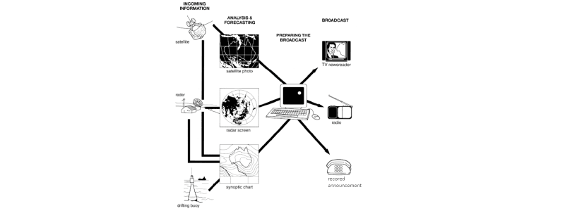
Check the writing task 1 sample answer process diagram 4 for the above process diagram.
5. The diagrams below show how the fish canning is done.
Summarise the information by selecting and reporting the main features, and make comparisons where relevant.
Write at least 150 words.

Check the writing task 1 sample answer process diagram 5 for the above process diagram.
6. The diagram below shows the process for recycling plastic bottles.
Summarise the information by selecting and reporting the main features, and make comparisons where relevant.
Write at least 150 words.
Check the writing task 1 sample answer process diagram 6 for the above process diagram.
7. The diagram below shows how rainwater is reused for domestic purposes.
Summarise the information by selecting and reporting the main features, and make comparisons where relevant.
Write at least 150 words.
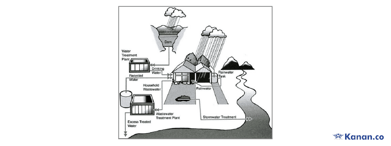
Check the writing task 1 sample answer process diagram 7 for the above process diagram.
8. The diagram below shows the process of making soft cheese.
Summarise the information by selecting and reporting the main features, and make comparisons where relevant.
Write at least 150 words.
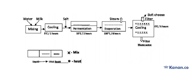
Check the writing task 1 sample answer process diagram 8 for the above process diagram.
9. The diagram below shows the production and processing of milk production for commercial sale.
Summarise the information by selecting and reporting the main features, and make comparisons where relevant.
Write at least 150 words.
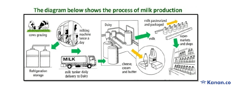
Check the writing task 1 sample answer process diagram 9 for the above process diagram.
10. The diagram below shows the steps of processing cocoa beans.
Summarise the information by selecting and reporting the main features, and make comparisons where relevant.
Write at least 150 words.
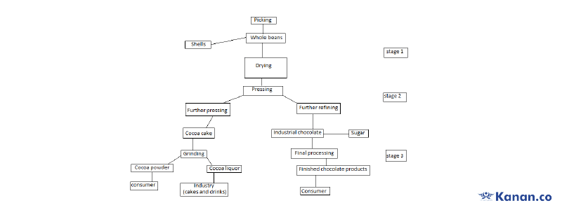
Check the writing task 1 sample answer process diagram 10 for the above process diagram.
Table chart
Task 1 table chart is one of the easier question types that is asked in the writing task 1. You need to just look at the data given in the table and write an essay by comparing the information.
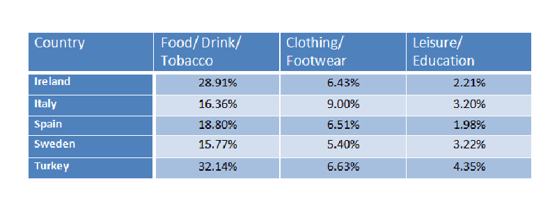
1. The table below gives information on consumer spending on different items in five different countries in 2002.
Summarise the information by selecting and reporting the main features, and make comparisons where relevant.
Write at least 150 words.
Sample Answer
The table provides the information about the spending made by the consumers in the year 2002 in the countries like Ireland, Italy, Spain, Sweden and Turkey.
From the given table, it is clear that people of these 5 countries spent more on food/drink/tobacco in comparison to other products like clothing/footwear and leisure and education.
As per the given data, the people of Turkey are the highest spenders of the food/drink/tobacco while the Sweden people are the least. Other than Turkey people, people of Ireland also spend 28% for food/drinks and tobacco.
When it comes to clothing/footwear, Italian people spend the maximum of 9% and in the meanwhile households of Ireland, Spain and Turkey spend more than 6% and among these without much difference people of Sweden spend 5.40% for clothing.
While looking at the education and leisure activities, people from all five countries spent less than other consumer products. Turkish people spent the most on education and the Spanish people are the least spenders among the 5 country people in 2002.
(182 words)
Bar chart
In the IELTS writing task 1 bar graph also known as bar graph which is similar to the line graph with x and y axes, shows how the particular information has changed over the period of years.
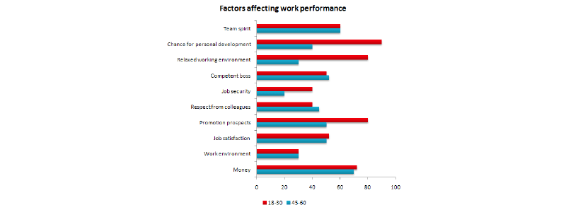
1. The bar chart below shows the results of a survey conducted by a personnel department at a major company. The survey was carried out on two groups of workers: those aged from 18-30 and those aged 45-60, and shows factors affecting their work performance.
Summarise the information by selecting and reporting the main features and make comparisons where relevant.
Write at least 150 words.
Sample Answer:
The given bar graph shows the comparison of different factors which creates an impact towards the employee’s work performance. The graph differentiated the job performance of the two age groups - 18 to 30 years and 45 to 60 years.
Overall, people in the age group of 18-30 consider factors like personal development, working environment, promotion and money. On the other hand, people at 45-60 years of age are impacted by factors like money, a competent boss and team spirit.
Firstly, young people highly prefer the chance for personal development in an organisation which is the top most affecting factor of job performance. Thereafter, a relaxed working environment. promotion and money are the top factors that impact their performance. On the other hand, job satisfaction, job security and work environment are the least factors that affect the performance of the young people.
On the contrary, people who are in the age group of 45-60 have said that team spirit and money are the important driving factors for better performance. And, the consideration of job security and work environment is least among these age people. For the other factors, they have given considerably lower yet equal preference.
(196 words)
Download the IELTS writing task 1 sample answer pdf
Conclusion
Hope this article will give a clear idea of how to write an essay and the different types of writing task 1. Use the given IELTS writing task 1 sample answer to practise each question type effectively.
FAQ
1. How to practice for IELTS writing task 1?
Step 1: Give a brief introduction by rephrasing the given question
Step 2: Write an overview of what the graph/chart shows
Step 3: Identify the key features
Step 4: Give explanation in two paragraphs
2. Can we write 200 words in IELTS writing task 1?
You can write a 200 word essay in the IELTS writing task 1. As there is no upper word limit suggested by the official conducting bodies. The minimum word limit of IELTS writing task 1 is 150 words.
3. Can we write 5 paragraphs in IELTS writing task 1?
In IELTS writing task 1, four paragraphs are suggested which includes introduction, overview, and 2 body paragraphs. However, in some cases a total of 5 paragraphs are needed.
4. Which tense is used in writing task 1?
Tenses like present tense, past tense and future tense are used in the writing task 1. However, it might vary depending on the data given in the graph/chart/map/diagram.
5. What are the topics in IELTS writing task 1?
IELTS writing task 1 has topics such as:
- Line graph
- Bar chart
- Process diagram
- Table chart
- Pie chart
- Map

About Author Arivarasi
Arivarasi is an experienced author with expertise in the study abroad industry and preparing test materials for exams like IELTS, TOEFL, GRE, SAT, PTE, etc. She stays up-to-date with university and college requirements for international students which allows her to provide guidance on course selection, documents like SOP, LOR, and scholarship opportunities. She has written numerous articles on study abroad exams, destinations, universities & colleges requirements, admission procedures, and the entire process of studying abroad. Collaborating with industry experts and counselors, she crafts informative articles that make students take the right decisions.
Kanan.co is a trusted study abroad consultancy offering comprehensive services, resources, and solutions for students and education institutions. We support students at every stage of their global education journey, ensuring a smooth and guided experience. Along with test preparation for IELTS, GRE, TOEFL, and SAT, we provide expert services such as SOP writing, visa guidance, accommodation support, scholarship assistance, and education loan support. Our expertise and commitment to excellence make us a reliable partner for students pursuing international education.
Free Online Mock Test 2026
Practice our mock test worth Rs. 25000 for Free and know your IELTS score!








Global Headquarters
Kanan Int EdTech Inc
320 Bay Street, Suite 321 (Spaces), Toronto ON, Canada M5B 1N9
Indian Headquarters
Kanan International Pvt. Ltd.
D-wing, 2nd Floor, Trident Complex, Ellora Park Vadiwadi Road, Vadodara, Gujarat 390007
IT/ Digital Campus
Kanan International Pvt. Ltd
Old, New No 3, 2nd Floor, 1A, Dr Sadasivam Rd, T. Nagar, Chennai, Tamil Nadu 600017
Our branches
- Bardoli
- Bharuch
- Chennai
- Dehradun
- Gurugram
- Himatnagar
- Karnal
- Nadiad
- Navsari
- Palanpur
- Rajkot
- Vadodara
- Valsad
- Vallabh Vidyanagar
- Vapi
Study Abroad
Test Prep
Top Universities
Consultants
IELTS Centers
GRE Centers
TOEFL Centers
SAT Centers
Language Courses in Vadodara
SOP Blogs
Featured Blogs
Study Abroad Consultants in Chennai
Study Abroad Consultants in Surat
Study Abroad Consultants in Navsari
Study Abroad Consultants in Bardoli
Study Abroad Consultants in Ahmedabad
Study Abroad Consultants in Anand
Study Abroad Consultants in Khanna
Study Abroad Consultants in Nadiad
Study Abroad Consultants in Vadodara
Study abroad consultants in Valsad
Copyright © 2026 KANAN.CO All rights reserved.